От халепа... Ця сторінка ще не має українського перекладу, але ми вже над цим працюємо!

Eatmap: mobile app development for food discovery app
Eatmap is a social app for discovering eateries. Users can also capture, upload, rate, and share stories, like experiences at eateries. Those short videos will be pinned to the eatery on the app’s integrated map for other users to browse.
The client asked NERDZ LAB to design, develop, and release an iOS version of the app to the AppStore.
Let’s take a deep dive into the product design process as a whole, the challenges we overcame, and how we did it.
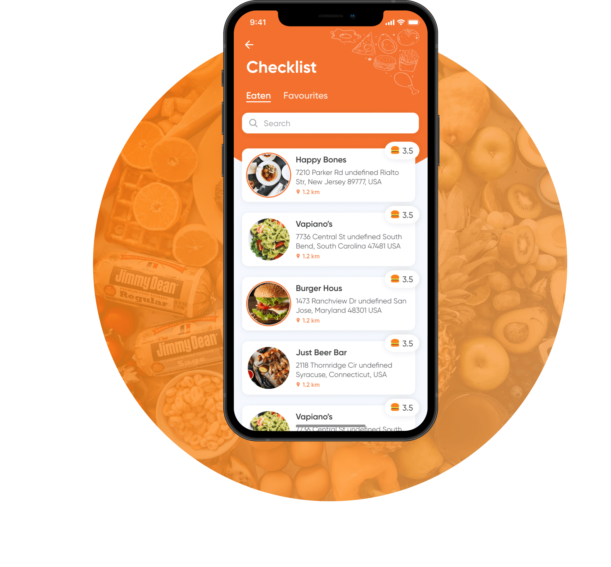
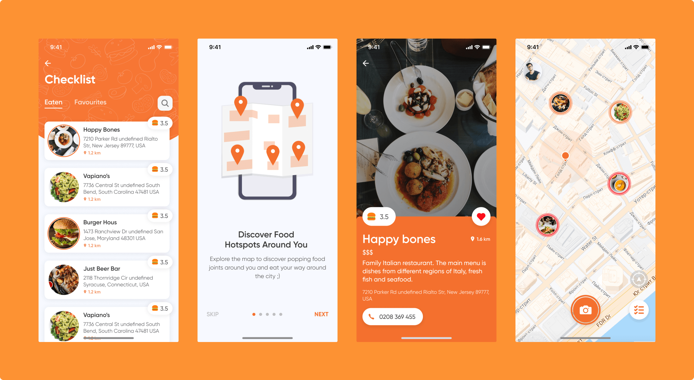
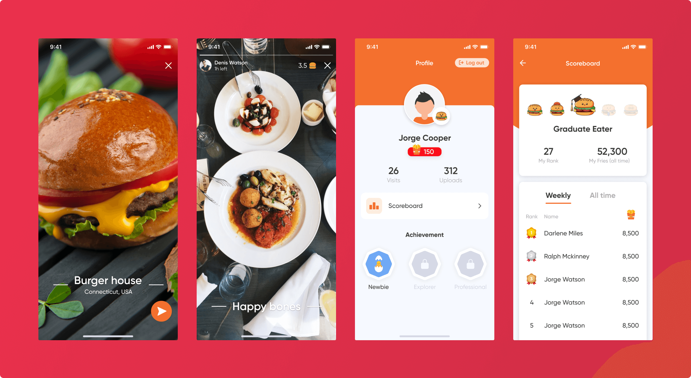
SCREENS:
Services
Product design
UX design
UI design
Mobile development
iOS
Technologies:
Swift
RxSwift
Mapbox
Team composition:
1 iOS developer
1 Back-end developer
1 QA engineer
1 Delivery
1 Project manager
THE CHALLENGE
A vague idea with a tight budget
The client came to us with a vague idea and asked us to shape and implement it in a working app. In addition, they were pretty strapped for funds, so we had to develop a solution that met a budget constraint.
Instagram for restaurants
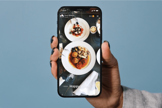
One of the main requests was to create a stories feature. They wanted the app to show short videos of users’ experiences at local eateries.
Interactive map with fast-downloading videos
NERDZ LAB had to deliver a solution that displayed eateries nearest to a user’s location. In addition, the client wanted us to implement animated objects that would download and appear on the map without lag, along with many short videos created by users.
Gamification aspect
The client envisioned a competitive element to encourage users to use the app more and thus retain users.
Complex market research
After several meetings with the client, NERDZ LAB conducted a comprehensive review of existing products on the market. We outlined the future product’s prospective competitors and analyzed and compared them to our client’s needs, requirements, and capacity.
Data handling
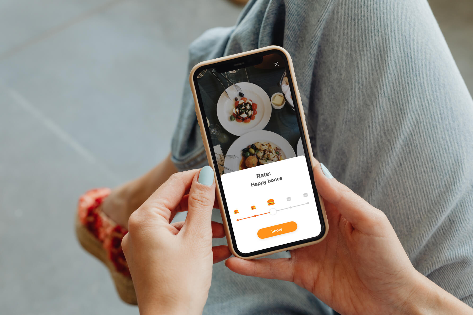
With appropriate permissions management, like access to a device’s camera, contact info, and user’s content, we enabled features to capture, upload, share, and rate food experiences.
Customized animations on the integrated map for better performance
NERDZ LAB analyzed all existing map solutions on the market. Based on the client’s requirements and budget, we picked Mapbox.
The dev team created customized animations for pinned stories to reduce the load on the map itself and use as few resources as possible compared to ready solutions existing on the market. This choice also allowed for smooth scrolling.
For the Eatmap 2.0 release, we planned to cluster the pinned stories according to their similar geolocation to reduce the workload on the map. This way, a large number of places in one area wouldn’t overload the map rendering.
Scoreboard with points for reviews
We implemented in-app bonuses (e.g., fries) for visiting and sharing newly discovered places. This feature added a gamification factor: getting scores for competition among app users.
DESIGN OVERVIEW
Before developing the product design, we knew that this would be a user-based application. All the interactions and flow inside the app should focus on being user-oriented yet appealing and competitive within the market.
After interviewing the client and doing deep market research, we created a mood board with all the matching competitors we found. Then we categorized all their functionalities. This helped us focus on an array of features, their necessity, and the complexity of implementation and pick the most critical features according to the client’s budget.
Design services we provided:
- Design discovery & research
- UX design
- UI design
Design solutions:
Design workflow
Information architecture
NERDZ LAB designed a complete view of the app information architecture, covering its infrastructure and core features.
Wireframes
We built wireframes of the app page layout that depicted future interface elements. This let us capture the app structure that would cover end-user needs.
UI/UX design
The team created a catchy yet simple interface in line with the needs of avid restaurant-goers and visitors seeking places to eat. We completed this stage by testing all UX interactions inside the app.
THE RESULTS
A stable MVP version to test the market
An in-app map that identified restaurants near users
Interactive platform with Instagram-like stories and videos about local places to eat
A gamified solution to earn points.
