От халепа... Ця сторінка ще не має українського перекладу, але ми вже над цим працюємо!
Experience Hampshire: How to design and develop a booking platform for relaxing activities
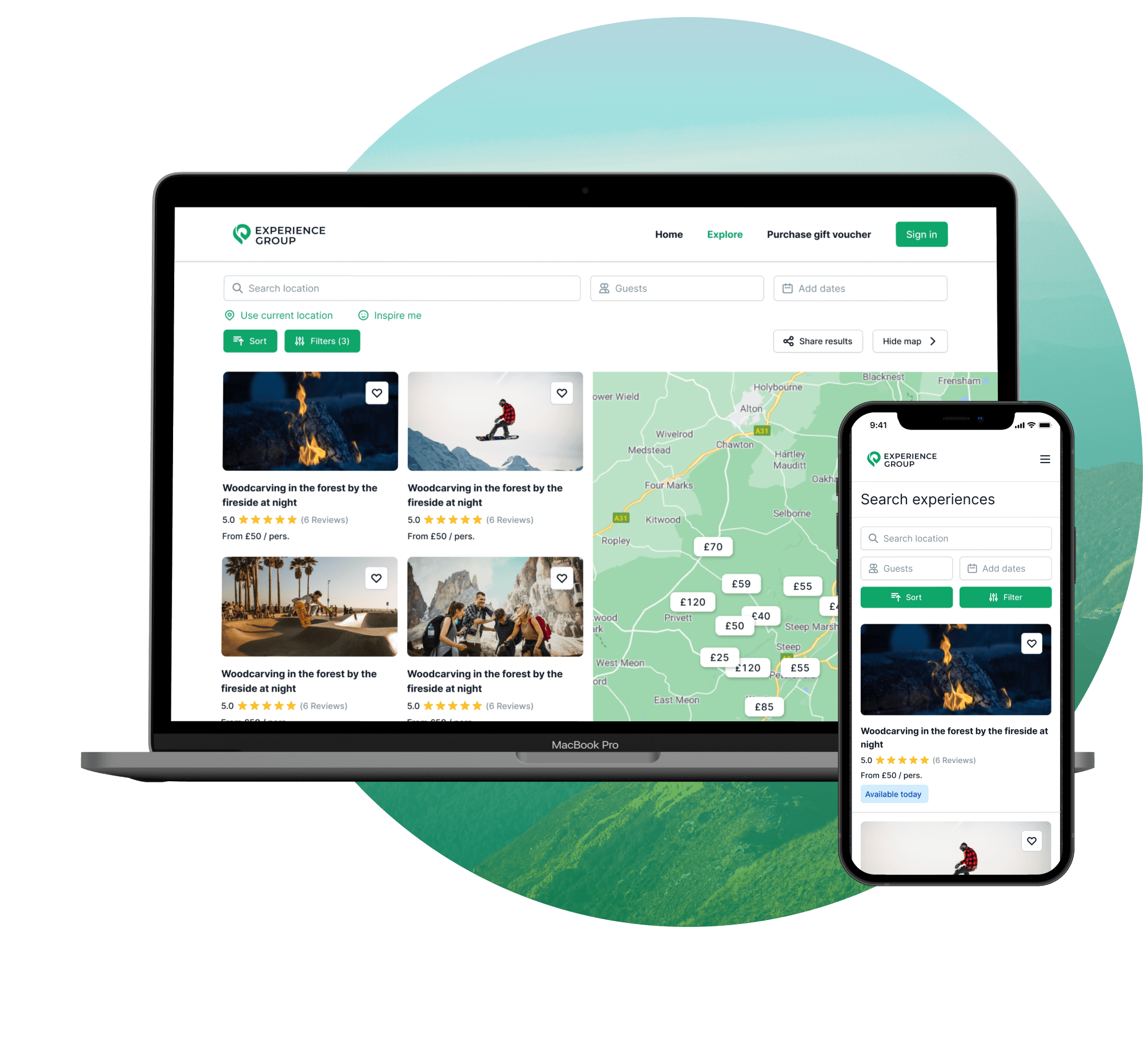
Experience Hampshire is a platform by Experience Group, a UK-based startup, for Hampshire visitors and residents to book local activities.
The company needed tech-savvy resources to scale the business. NERDZ LAB had already shared projects with them, so we became their first choice for the platform development.
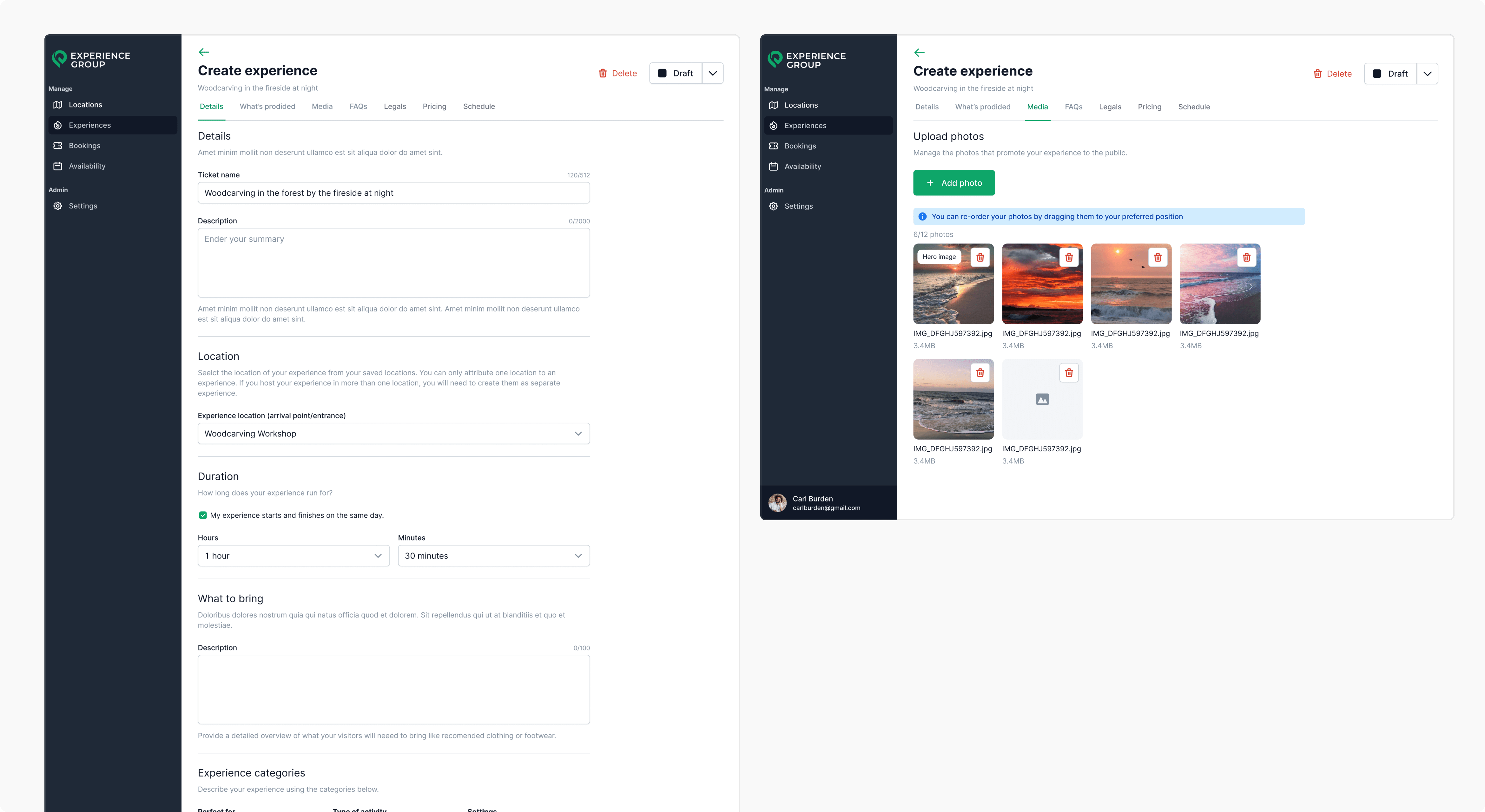
The client requested us to design and develop a booking platform from scratch, combining: the customers’ side, to discover local experiences and events and manage their bookings; the partners’ side, to offer and manage their services; the admin’s side, to collect data for further analytics.
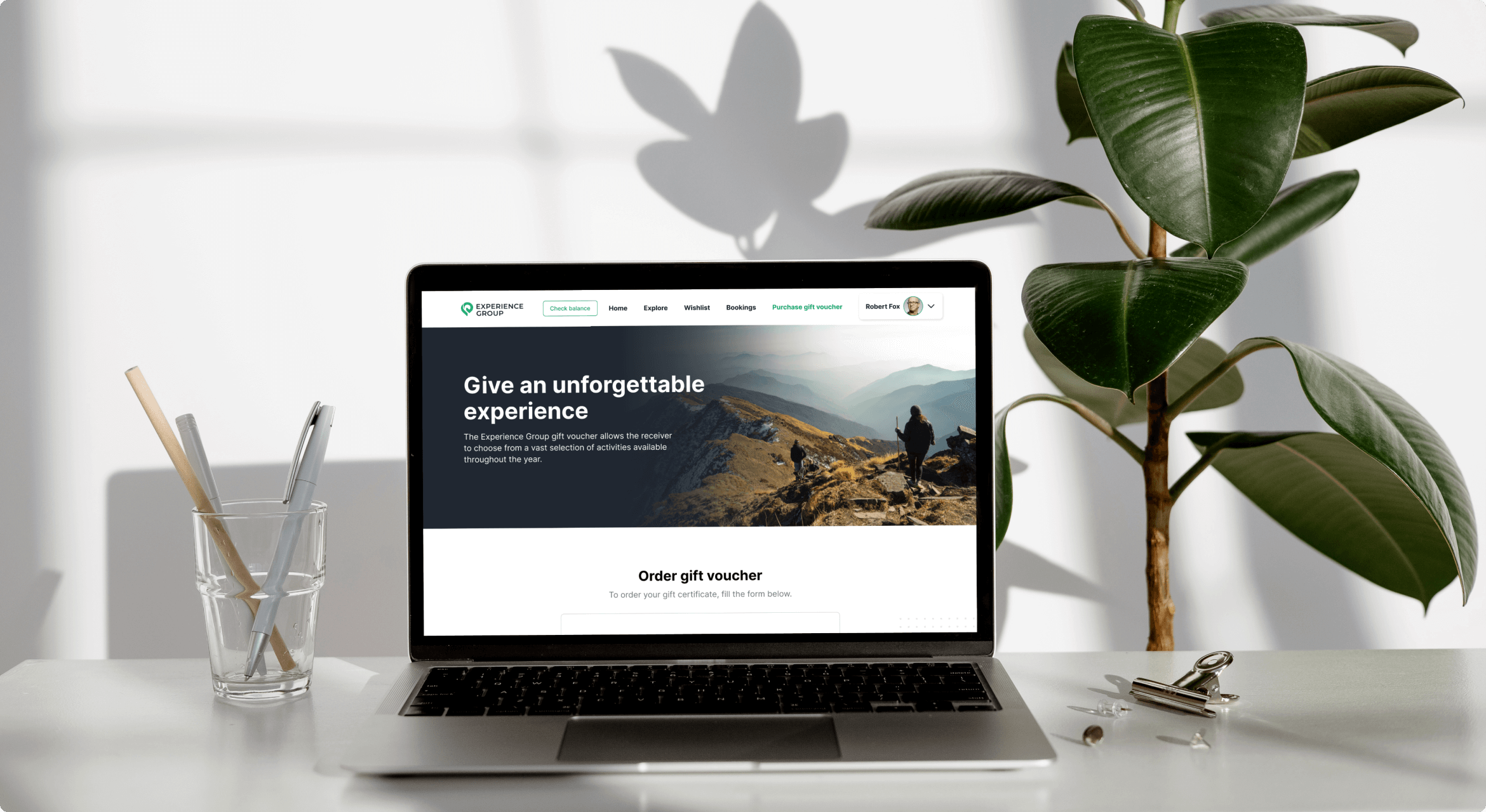
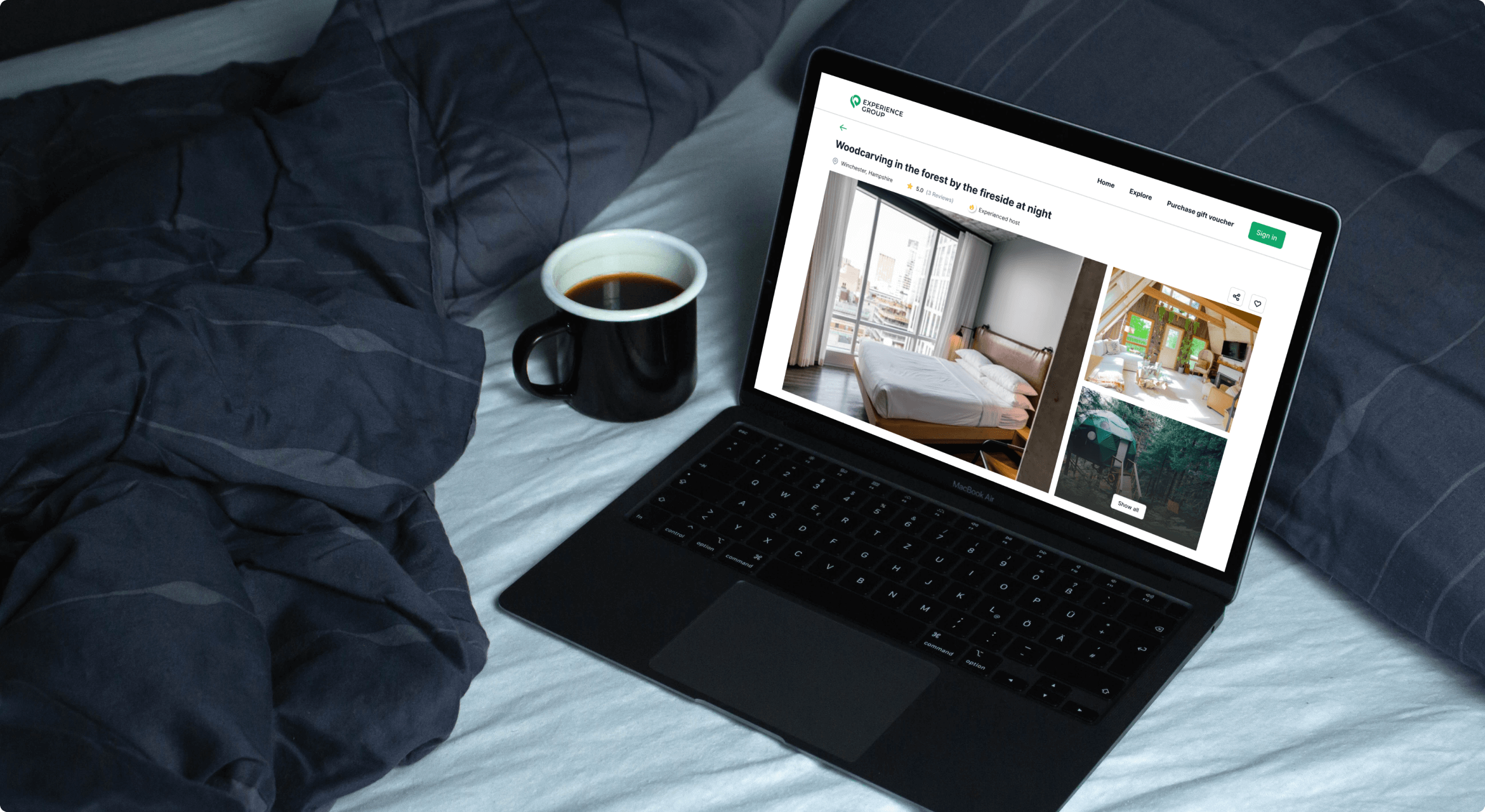
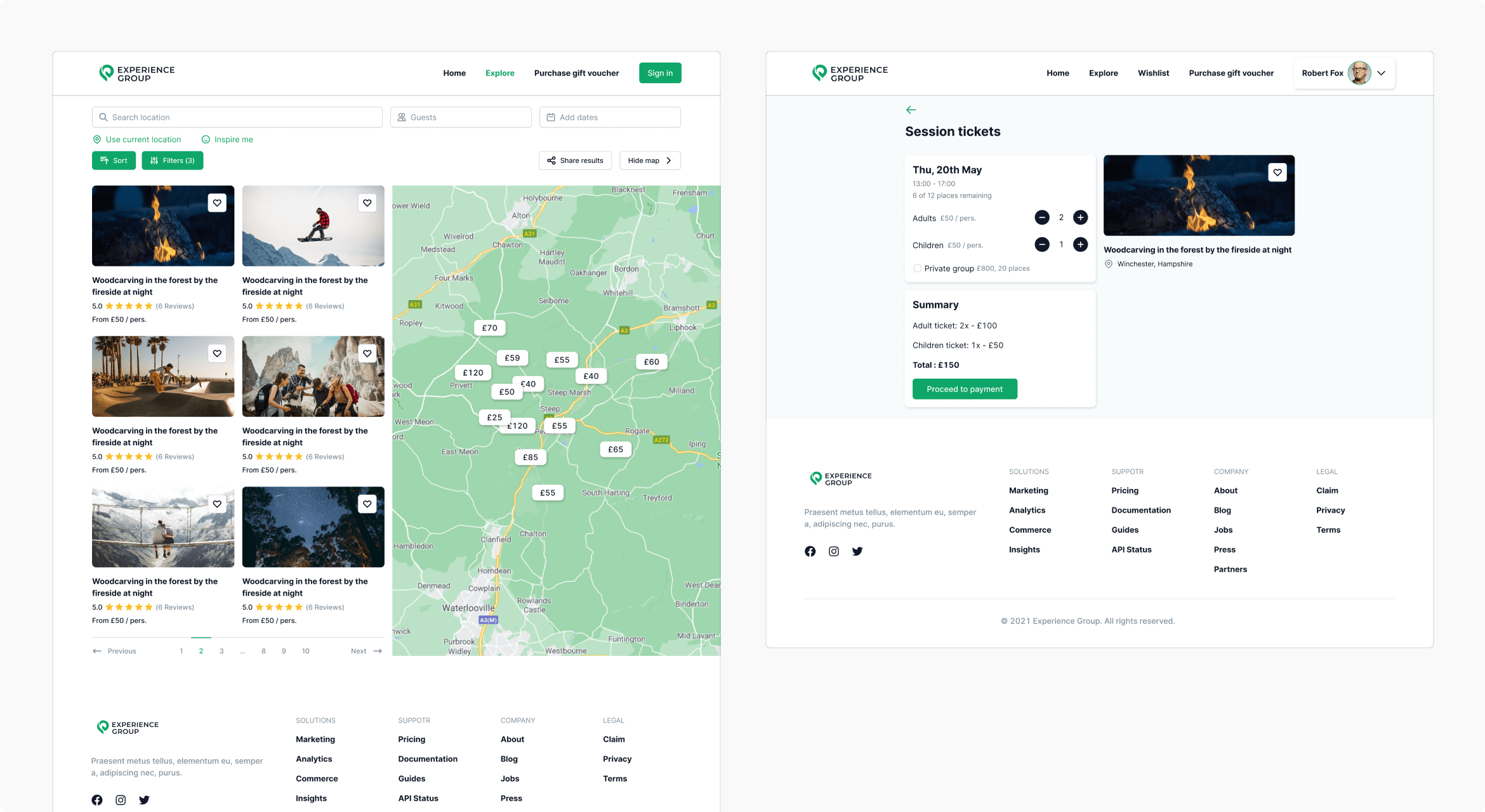
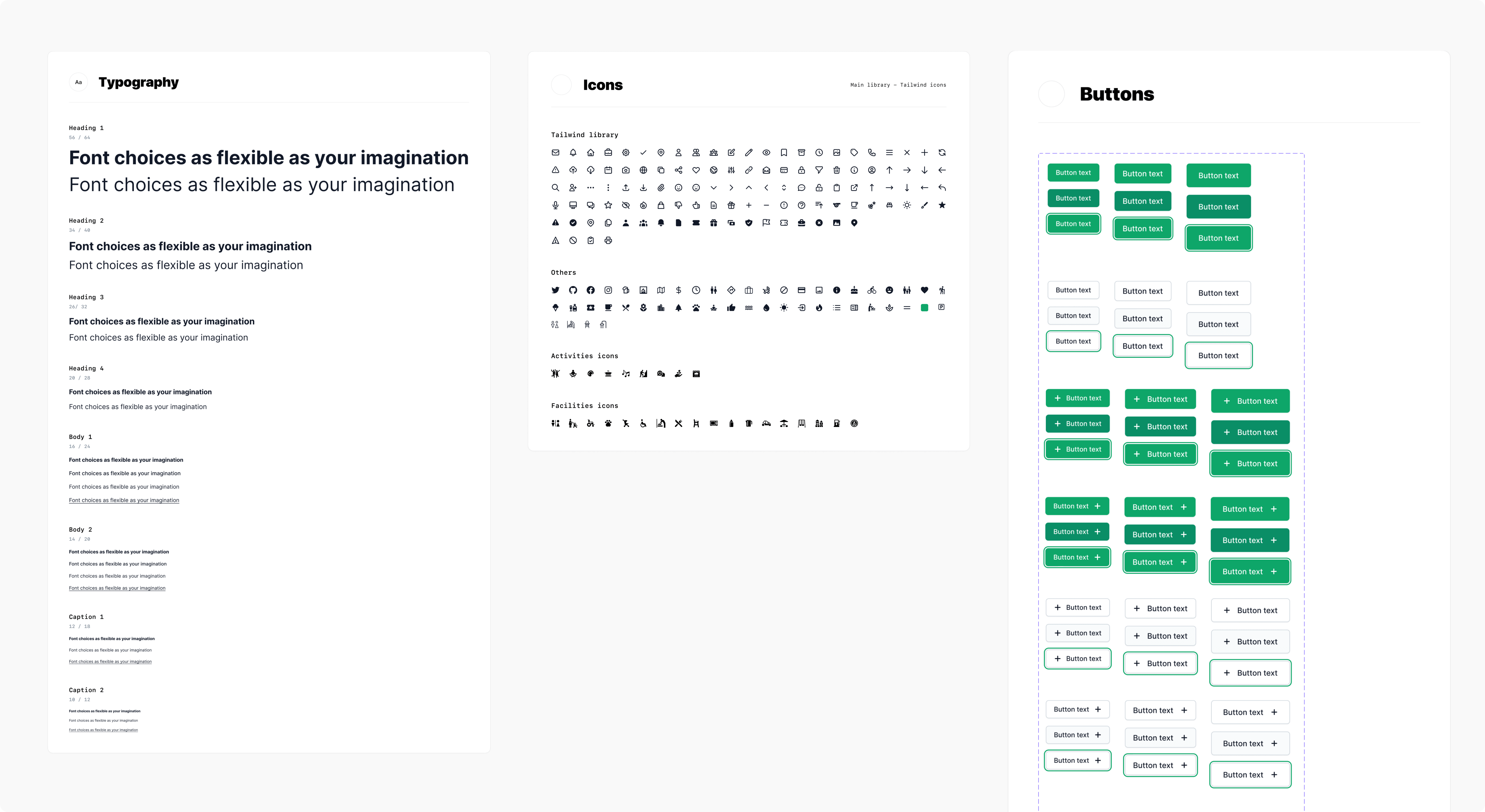
SCREENS:
Services
Product design
UX design
UI design
Web development
Front-end
Back-end
Technologies:
Figma
Typescript
Vue.js
Nuxt.js
Composition API
Tailwind CSS
Team composition:
1 UI/UX designer
2 Front-end developers
2 Back-end developers
1 QA engineer
1 Project manager
THE CHALLENGE
So, in general, we had to design and develop a user-centric, mobile-friendly platform with further scalability and a visually appealing layout.
After several short but intensive meetings with the client, we outlined several challenges to address as follows.
Time-sensitive and complex platform
NERDZ LAB had to build a broad application for three types of users: customers, partners, and administrators, with different functionalities for each type. Given this, we had a tight schedule to create it in only three months.
User-oriented application
Our main goal was to create a customer-centered portal that would be attractive to visitors, meet all their needs, and cover nice-to-do activities. Besides this, despite its complexity and scalable nature, it was supposed to keep the performance outstanding.
Clear scheduling system
Since this is a booking platform, we had to include a scheduling feature. It had to align with both customers’ and partners’ sides, providing a rescheduling option if overbookings occur.
SEO-friendly website
The development team needed to include a blog to make the platform more valuable for first-time visitors, who hesitate to get the local experience but don’t mind reading some helpful content. With this, we also kept SEO best practices in mind to make the website visible to users.
Smooth payment system
Our goal was to establish a transparent and consistent payment system for customers. It would also ensure the experience providers get funds for their services fast.
Crystal clear control
As the portal requires administration, we also had to set up a panel to manage bookings, gather users’ data, and process and use the data for further analytics.
We suggested the following solutions upon choosing specific programming tools and establishing the proper development workflow.
Combination of human effort and technology
First of all, we staffed the project with properly picked developers matching all the client’s requirements. Proceeding with regular brainstorming and close teamwork, we addressed the business logic. Choosing TailwindCSS helped us cut the development time for the UI part significantly without losing its quality.
Wise framework choice
To solve the issue of good performance and smooth operation on the users’ side, the team opted for powerful development tools. Nuxt.js, with its server-side rendering feature, combined with Composition API, famous for its code reusability attribute, were chosen. We also improved the customer experience on the platform using real users’ reviews. Altogether, it significantly enhanced the user experience.
Customized booking system
As the client’s requirements for the scheduling part were very peculiar, NERDZ LAB created the booking system from scratch. A customized solution based on PHP Laravel technology allowed us to cover all business needs.
Robust payment integrations
The team set up the Stripe system to receive, process, and transfer funds for bookings. To improve the payment experience, we enabled the platform to create vouchers, promo codes, and referrals. Such an option allowed the client to increase the end-users’ loyalty.
CMS integration
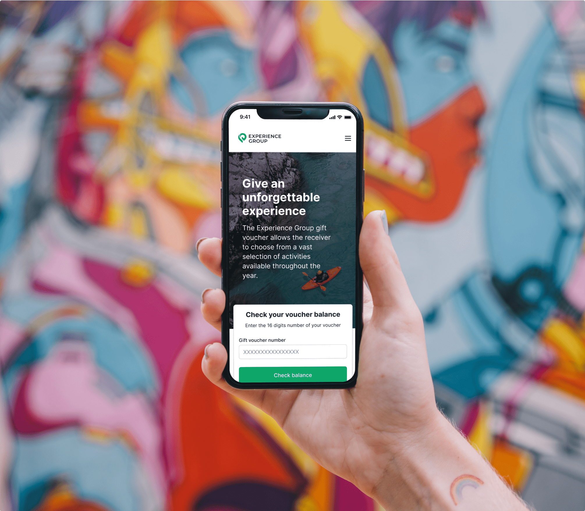
To cover the needs for the content part of the application, NERDZ LAB suggested storyblok.com as a solution. It would help the client publish and manage helpful content for the website visitors, keeping them more engaged.
Strong admin panel
In creating the management element, we didn’t only consider handling the customers’ and partners’ sides and their scalability. We also strived to build an insightful analytics tool to improve the platform in the future. For this purpose, we took Laravel Nova as a foundation, because it allows for sharing for a bigger number of admins and enables more customization, which together met our client’s requirements.
DESIGN OVERVIEW
This project was intended to create a platform to assist customers with searching and booking experiences online. The idea was to build a resource that would cover the needs of both sides: customers and suppliers.
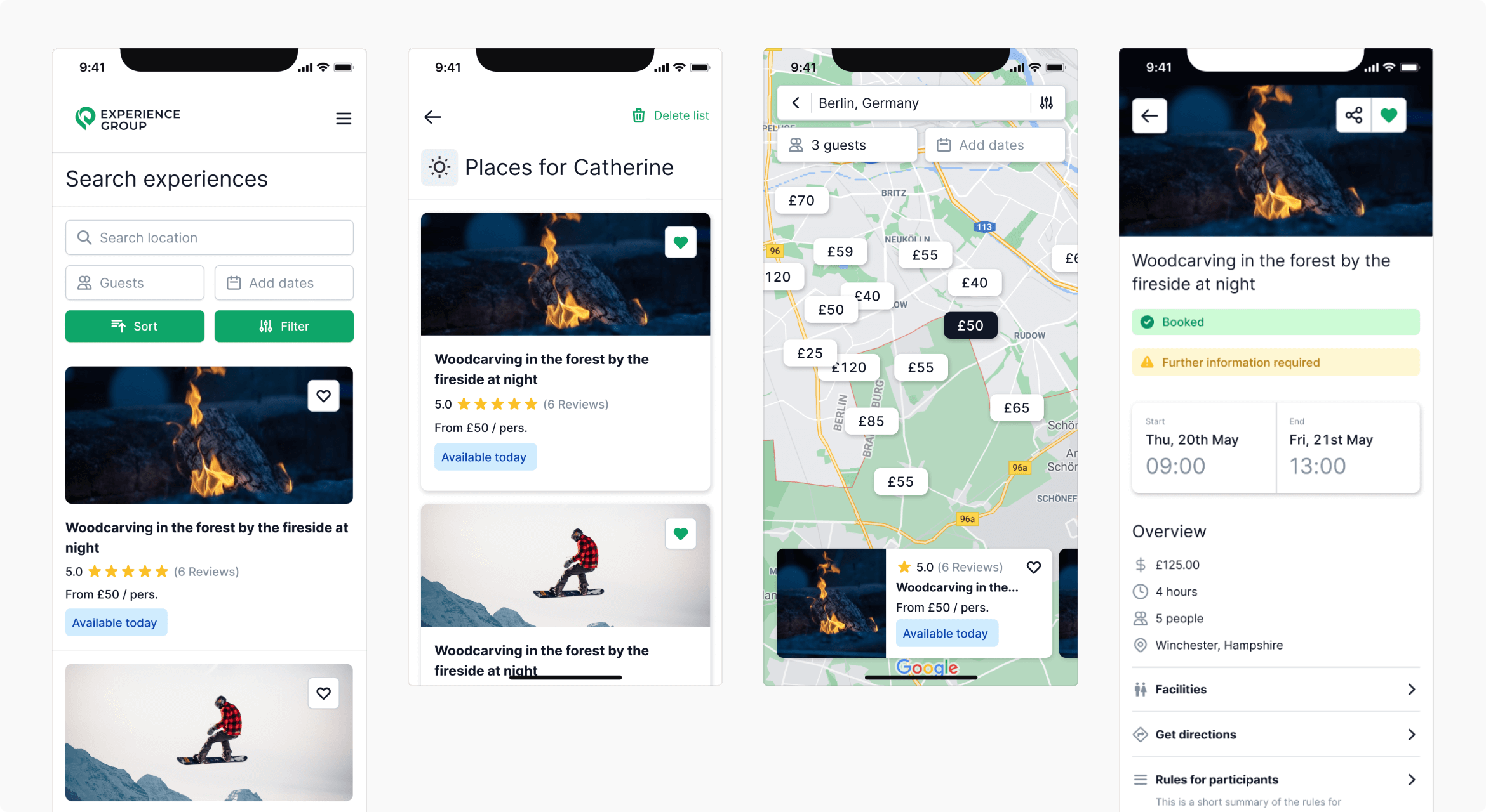
Initially, the client provided mockups and sketches with their vision for the product. Based on that, our team designed separate journeys for two user roles: customer and supplier. We decided to go with clean, bright colors, reflecting the platform theme. Once we finalized our customized web design, we moved to user-friendly mobile design creation, which reflected the functionality of the customer’s role.
As a result, we provided a web platform with two user roles, followed by a mobile version.
- UX design
- UI design
Design solutions:
Design workflow
Design discovery & research
During the design discovery stage, we help clients see if their idea actually solves their customers’ problems.
Creating UX
This is where we form an intuitive and easy-to-navigate user experience aligning with usability guidelines and the product mission.
Building UI
At this stage, we give the product a visual shape. We ensure the client’s preferences meet the latest UI trends to design an interface that’s pleasant for the users.
Product designing process_snippets
THE RESULTS
Successful product launch
A growing number of customers and partners
An 88% accessibility
100% web platform best practices
Continuous support of the app and adding of new features


