От халепа... Ця сторінка ще не має українського перекладу, але ми вже над цим працюємо!
KAI: An AI-powered web module for improving online and in-person communication
KAI is a London-based startup product development company specializing in AI learning software that improves verbal interactions between sales and marketing representatives and their clients. KAI’s artificial intelligence solutions analyze all types of interaction (online, over the phone, and in-person) and suggest ways to make them more effective, client-oriented, and positive.

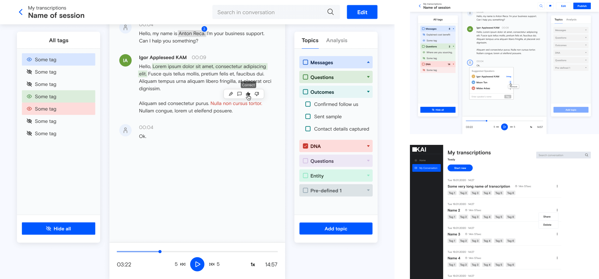
SCREENS:
Services
Product design
UX design
UI design
Web development
Front-end
Back-end
Technologies:
Figma
Vue.js
TypeScript
Team composition:
1 Front-end developer
1 Back-end developer
1 QA engineer
1 Project manager
THE CHALLENGE
NERDZ LAB’s task was to develop an integrated web-based module as an additional internal component to the client’s AI solutions. The module had to integrate with any website, teach AI models to identify areas for improvement, and then provide sales reps with actionable outcomes. The module would help KAI’s team of in-house testers quickly and efficiently assess the quality of text-based interactions.
Here’s how it works:
-
- The module converts a recorded conversation between a sales representative and a prospective client into text.
- Next, the tester listens to the audio and suggests how the conversation could be improved—which words to use, which style and tone of voice would be more appropriate, and so on.
- This feedback is then used to teach KAI’s AI algorithm for sales interaction training.
Our team identified the functionality that KAI’s AI learning software had to offer so that testers could optimize their workflow. There were four main challenges:
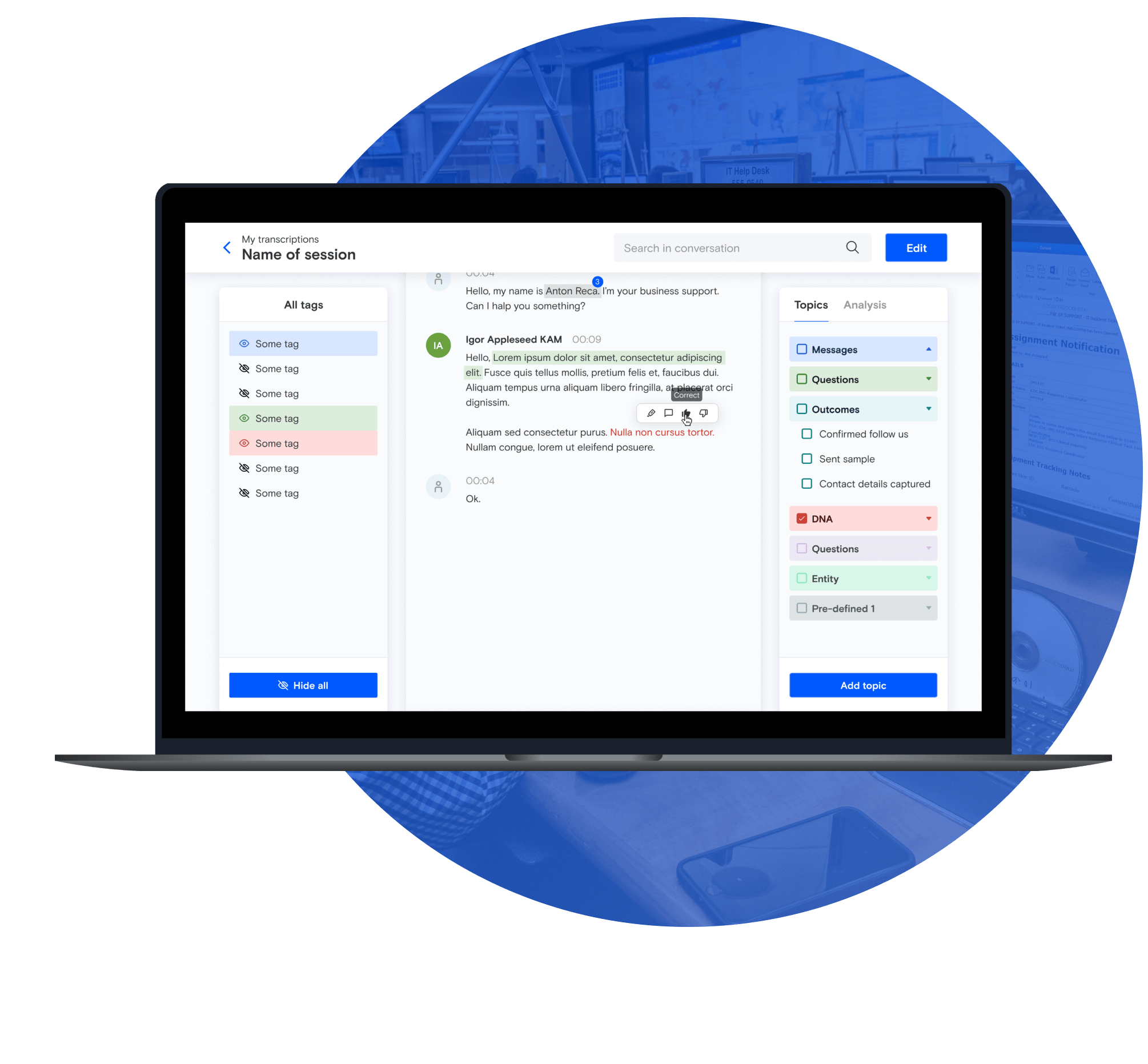
- A custom text editor. We had to create a custom text editor since the standard one didn’t support the required editing features. For example, text needed to be able to show graphical elements such as badges, highlights, and tags. Moreover, the text editor had to include other visual features—speakers—laid out as the editor image on the left with the name above the text. We had to make speaker elements a part of the general text editor so that testers could work with the text throughout the entire conversion, not just with one speaker’s part.
- Lengthy conversations. The average 30-minute call contains approximately 15,000 words. That’s a lot of data to process—and a common reason for a system freeze. Our solution had to load all this data while keeping real-time performance sharp since every second of a system freeze negatively impacts a tester’s work. A tester may need to change the text quickly and type without long pauses. Consequently, our task was to make the entire system run smoothly and give the user the feeling that they are simply typing, with no complex processes in the background.
- Text and audio synchronization. Each word has its own timecode, which allows the system to highlight words as they are played in the audio. However, when a tester makes changes to the text—such as adding or deleting words while the audio remains unchanged—these timecodes have to be recalculated. Timecode recalculation is challenging, as each word’s timecode depends on the timecodes of neighboring words, the length of the text, the way the word is pronounced, and so on. We had to take all of these things into account to ensure timecode accuracy.
- Search and edit issue. When a tester highlighted, tagged, or made any other visual change to the text, this would trigger a re-rendering of the entire text component. This created a significant system lag which was negatively impacting user experience. The most challenging task was to render only those text components that were highlighted, tagged, or otherwise changed without affecting the other components.

NERDZ LAB came up with the following solutions:
- We created a custom text editor tailored to the client’s needs. The editor is a technologically complex solution with advanced markup features such as highlights, tags, badges, and more. It also allows testers to edit a conversation quickly and seamlessly. For instance, a tester can add a new speaker by simply hitting Enter to insert a paragraph break. When this happens, the system automatically identifies a change of speaker. Conversely, removing a paragraph break adds the line to the previous speaker.
- We modified the component hierarchy to reduce the impact of changes to elements. With this solution, we tackled the challenges above in three steps:
1.We changed the component logic from word-based to speech-based. Originally, one word was one visual component, which meant that each component had to be re-rendered when changes were made. With this logic, we could highlight the background of the particular component so that the word was considered highlighted.
With the new design, the visual component covers the entire text of one speaker. Reducing the number of components like this cuts down rendering time and the time needed to process each component, significantly improving user experience and performance.
However, this approach made word highlighting much more complicated. We had to define the exact position of a word in a text by finding the coordinates of the zone in which the word is placed. We then had to render a zone according to the same coordinates.
2. We added rules to define which components are affected by changes. With rules, when a specific component is changed, only the components defined by the rule are re-rendered. This achieves the desired goal of preventing the entire text from re-rendering after changes.
3. We designed an algorithm to recalculate timecodes. The original system was constantly getting bogged down with timecode recalculations following every change. We moved most calculations server-side, which freed up the front end and improved overall system performance. We combined our complex timecode calculation algorithm with lazy evaluation. Lazy evaluation means that timecodes are calculated only when it’s really necessary, which also improves system performance.
DESIGN OVERVIEW
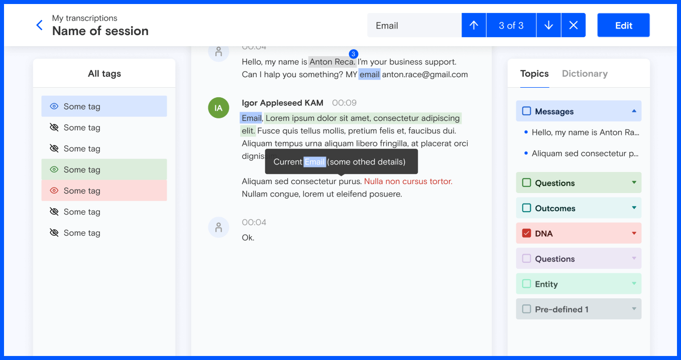
User-friendly UX design was central to reducing interpreting time for KAI testers. Since the words and phrases might have tags attached, we had to find a way to highlight words from the same category (such as product features, benefits, or drawbacks) and phrases with overlapping tags. We also had to teach KAI’s AI learning software how to detect whether all the words in a sequence belong to the same tag category. So the ultimate goal that we have successfully coped with was to make the text editor’s UX design as user-friendly and easy to navigate as possible.
- UX design
- UI design
Design workflow:
Client interview
Before the front-end development stage, we sat down with the client to discuss their needs, vision, and expectations of the module.
Competitor analysis
We analyzed the client’s competitors and similar platforms to see what was working best and understand what could be improved regarding UX and functionality. We used the results of the review to implement best practices in the client’s solution and avoid common UX design flaws.
Mood board
In this project, it was possible to carry out UI design and UX design simultaneously. We identified which UI trends would ensure an intuitive and easy-to-use interface that met usability guidelines and the product aim.
THE RESULTS
Upgraded AI learning software helped our client meet their project deadline and successfully launch their software.
The module has halved the time required to process end-client calls.
Optimized performance allows testers to work more efficiently and has reduced buffering during speech-to-text conversion.


