От халепа... Ця сторінка ще не має українського перекладу, але ми вже над цим працюємо!

Accessibility in mobile development: Creating an app for everyone

Vladyslav Martiak
/
iOS Developer
•
8 min read
Share:
Share:
•
8 min read
Article content:
In recent years, conversations about accessibility have become louder. Each year, companies that invest a lot in developing their mobile platforms, like Apple and Google, dedicate a segment of their keynote presentations to stressing the importance of accessibility and how it helps people in their daily lives. But why is it such a hot topic?
Approximately 10% of the world’s population lives with a disability. Organizations around the world and the governments of different countries increasingly implement new standards and strict guidelines for mass-use software. But how do you build an accessible app? We’ll present the thoughts of Vladyslav Martiak, our iOS developer (and former UI/UX designer), on the basic principles that make an app accessible to everyone. In addition, we’ll explore different levels of implementation, look at Android and iOS features for accessibility in mobile development, and share a use case from NERDZ LAB.
See also: Top features for health and fitness apps
Accessibility: Covering the basics
The concept of accessibility is multi-dimensional. Below, we list some of the accessibility issues people may have.
- Vision problems People who experience a partial or complete loss of vision, including a reduced ability to see color, may have difficulty seeing and using an app depending, for example, on what size text or color it uses.
- Hearing difficulties people who are deaf or hard of hearing may have trouble recognizing the sounds of an app.
- Mobility issues, like paralysis, tremors, or missing limbs, may interfere with using hardware elements like physical buttons and touch screens and interacting with on-screen content.
- Cognitive disorders range from reading and object recognition to memory, language production, and comprehension problems. Because cognitive disorders are highly variable from user to user, many elements of an app may present issues.
We should also consider that basically everyone may have special needs at one time or another. Here are some scenarios that come to mind.
- You’re holding your baby with one hand and using a phone with the other one while communicating with a doctor via video chat. As today’s phones are usually thin boxes with huge screens, you won’t be able to use your phone to its fullest capacity. This is a situational factor: your hand is busy at the moment, but it won’t be later.
- You had a great vacation in the snowy mountains, but unfortunately, you broke your arm on the last day of your stay. You’ll experience the same difficulties as the person in the first example, but for a much longer period of time, like a week, two weeks, or even a month. This is a temporary factor: your hand is injured, and it will take some time to recover.
- And finally, a worst-case scenario is that your hand is absent due to a car accident or other incident. This is a permanent factor because even if with a hand prosthesis, you may have special needs. But conceptually, what makes an app accessible? When designing and developing an app, you should keep in mind these three principles:
- Inclusivity is the practice of providing equal access to opportunities and resources for people who might otherwise be excluded due to physical or mental disabilities.
- Usability, in the context of mobile applications, is a measure of how easily a specific user can use a product to effectively, efficiently, and satisfactorily achieve a defined goal. In other words, how easy the application is to use.
- Accessibility is making your software product usable and accessible by as many people as possible, including people with special needs.
![]()
Why accessibility is a must today
Despite the obvious answer to this question, businesses also gain hidden benefits by making their apps accessible.
- Use loyalty. Various media resources publish different top-app lists, choosing the winning apps for their incredible ideas and designs and because the companies behind them care about all of their users.
- Profitability. Businesses can earn more by building an accessible app. If an app isn’t accessible, the business misses out on a partial profit from the 10% of the population with disabilities.
- Legislation. Most EU countries, as well as the UK and US, have implemented laws that encourage developers to create digital products that are more accessible to a broader user base. Some regulations even demand a certain level of accessibility for apps or websites that many consumers need, for example, apps for social services, health services, and banking.
See also: 5 ways to eliminate security threats in iOS app development
Implementing accessibility in an app
Now that we’ve discussed some basics let’s see how to apply them. There are a lot of different articles and blogs about how to make your application more accessible and user-friendly. Still, when considering people with special needs, government regulations provide comprehensive documentation and explanations on what should be added to enable disabled users to interact.
Let’s take a look at some of these considerations. The US Access Board, Section 508 of the US General Services Administration Rehabilitation Act, and the Web Content Accessibility Guidelines (WCAG) 2.1 make the following accessibility design recommendations that app developers should consider:
- Perception means including textual or auditory descriptions of the visual context.
- Controllability means offering different ways to control various interface elements, like a keyboard, voice, or other alternative input methods.
- Clarity entails ensuring that all interface elements and content are clear, complete, and unambiguous.
- Reliability signifies that software products must have maximum compatibility with currently existing devices.
(WCAG) 2.1, developed through worldwide collaborations, is extensive and requires a dedicated article to explain all of its benchmarks. This standard covers essential aspects of creating a genuinely accessible software product. It’s mainly used for designing and developing websites, but most practices apply to mobile applications.
This standard generally defines three levels of accessibility implementation: A, AA, and AAA, indicating low, medium, and high levels of accessibility, respectively. To formalize the requirements for a product to meet a specific level of accessibility, the WCAG lists elements that developers must include in their app to qualify for each of those. Lots of specialized software is available to check if a design meets accessibility standards before developers implement features and to test the accessibility features after development. Whether or not you develop applications for people with disabilities or special needs, it is always good practice to ensure your app meets some of the necessary standards. If the app isn’t convenient for typical users, how do you expect differently-abled people to use it? For a better understanding of WCAG, let’s have a look at one of its color and contrast standards:
Level А
As Success Criterion 1.4.1: Use of Color says, color is not the only visual means of conveying information, indicating an action, prompting a response, or distinguishing a visual element.
Level AA
As Success Criterion 1.4.3: Contrast (Minimum) suggests, the visual presentation of text and images of text has a contrast ratio of at least 4.5:1, except for the following:
- Large Text: Large-scale text and images of large-scale text have a contrast ratio of at least 3:1.
- Incidental: Text or images of text that are part of an inactive user interface component, that are pure decoration, that are not visible to anyone, or that are part of a picture that contains significant other visual content have no contrast requirement.
- Logotypes: Text that is part of a logo or brand name has no contrast requirement.
Level ААА
Images of text are only used for pure decoration or where a particular presentation of the text is essential to the information being conveyed, according to Success Criterion 1.4.9 Images of Text. As Success Criterion 1.4.6 Contrast states, the visual presentation of text and images of text has a contrast ratio of at least 7:1; exceptions are the following:
- The large text contrast ratio is at least 4.5:1.
- Secondary objects: “text and images of text that are part of inactive UI components,” that are only used for pure decoration, that is invisible to users, or are part of an image with other significant visual content have no contrast requirement.
- Logos: text as a “part of a logo or a brand name has no contrast requirement.”
Now, let’s look at some visual examples of how standards make a difference.

Text contrasting in design

Creating color labels using patterns

Providing recognizability using text positioning
Learn more: 10+1 steps to building UI/UX design for startups
Out-of-the-box capabilities, or How iOS and Android do accessibility for you
Let’s take a look at the accessibility features iOS offers to make life easier for users with special needs:
- VoiceOver describes the current on-screen options and other visual elements (photos, graphics).
- Magnifier uses the iOS device’s camera as a digital magnifying glass, increasing the size of any physical object you see.
- Speak Screen, even with VoiceOver off, can read the contents of your screen aloud clearly in multiple languages, whether the content is messages, emails, webpages, controls, or almost any other text.
- AssistiveTouch allows users to tap and create custom gestures specific to their needs for physical interaction with the device, including changing the volume, rotating the screen, and creating custom touch menus.
- Sound Recognition applies on-device intelligence to identify and notify users of specific sounds in their environment, like a smoke alarm, a baby crying, or a cat’s meow.
- Live Listen boosts sounds and facilitates conversations in noisy places transmitting sounds picked up by the iOS device’s internal microphone to Made for iPhone hearing devices.
Now, let’s explore Android’s capabilities.
- TalkBack is a screen reader that also uses audio feedback and vibration to help users with vision impairments interact with their devices.
- Voice Access lets users manage their Android devices via spoken commands.
Display Size can modify the default on-screen text or object size, with an option to display measurements and change fonts. - Live Transcribe is a speech recognition feature that helps deaf and hard-of-hearing users switch their devices to a live transcription mode.
- Sound Recognition informs deaf and hard-of-hearing users of sounds in their environment, such as fire alarms and doorbells, using on-screen notifications, a flash from the device’s camera, or a vibration.
- Real-Time Text allows switching from voice to typing during a phone call, which the person on the other end of the call sees in real-time. The other person can also type to you, which can be used with TTY to contact emergency services.
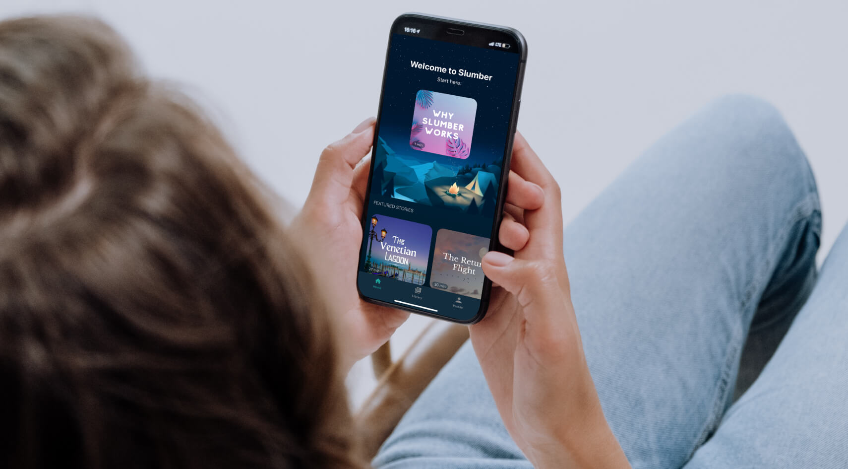
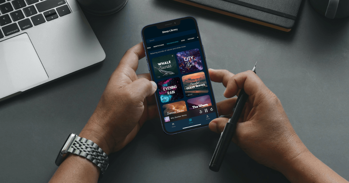
Accessible app case from NERDZ LAB
NERDZ LAB created an iOS sleep and meditation app that exemplifies accessibility in mobile development. This iOS-based MVP concept, which would later be developed into the app with a comprehensive design with animations and an extensive feature pack, demonstrated seamless usage for people with visual and hearing impairments. All features were supposed to adjust to a device’s screen size. Furthermore, the app should be compatible with the entire vision and design to give people with special needs the best possible experience.
NERDZ LAB worked closely with the client to fulfill their vision of a practical yet aesthetically pleasing solution for sleep and relaxation. We implemented features like the option to enlarge text and VoiceOver so that all elements and text would be accessible to all users.
Thanks to our approach, this app was a success, with over 2,000,000 downloads so far. The app was well-received by the media and praised by users and major websites, including earning a spot in Healthline’s “The Best Healthy Sleep Apps of 2020” list and Good Housekeeping’s “10 Best Sleep Apps to Download in 2021” list.
The entire development story is available here.
![]()
To wrap up
In this article, we described the fundamentals of accessibility on mobile platforms, design elements to consider when developing an app for people with different needs, and some existing standards supported by various organizations. Also, we hope you enjoyed reading a bit about the NERDZ LAB case. Stay tuned because articles on how to implement accessibility features in your application are coming soon.
Get more insights:
See all