От халепа... Ця сторінка ще не має українського перекладу, але ми вже над цим працюємо!
A product design for no-stress medicine ordering
The client is a UK–based healthcare platform that allows patients to order their medicine, check it with their doctors, track it, and pick it up at their local pharmacies. The platform connects to the UK’s NHS.
The client requested NERDZ LAB to work on the UX/UI design for their Android and iOS apps. Also, their available web platform lacked an admin function. So we were happy to help them cover their needs and complete their product design.
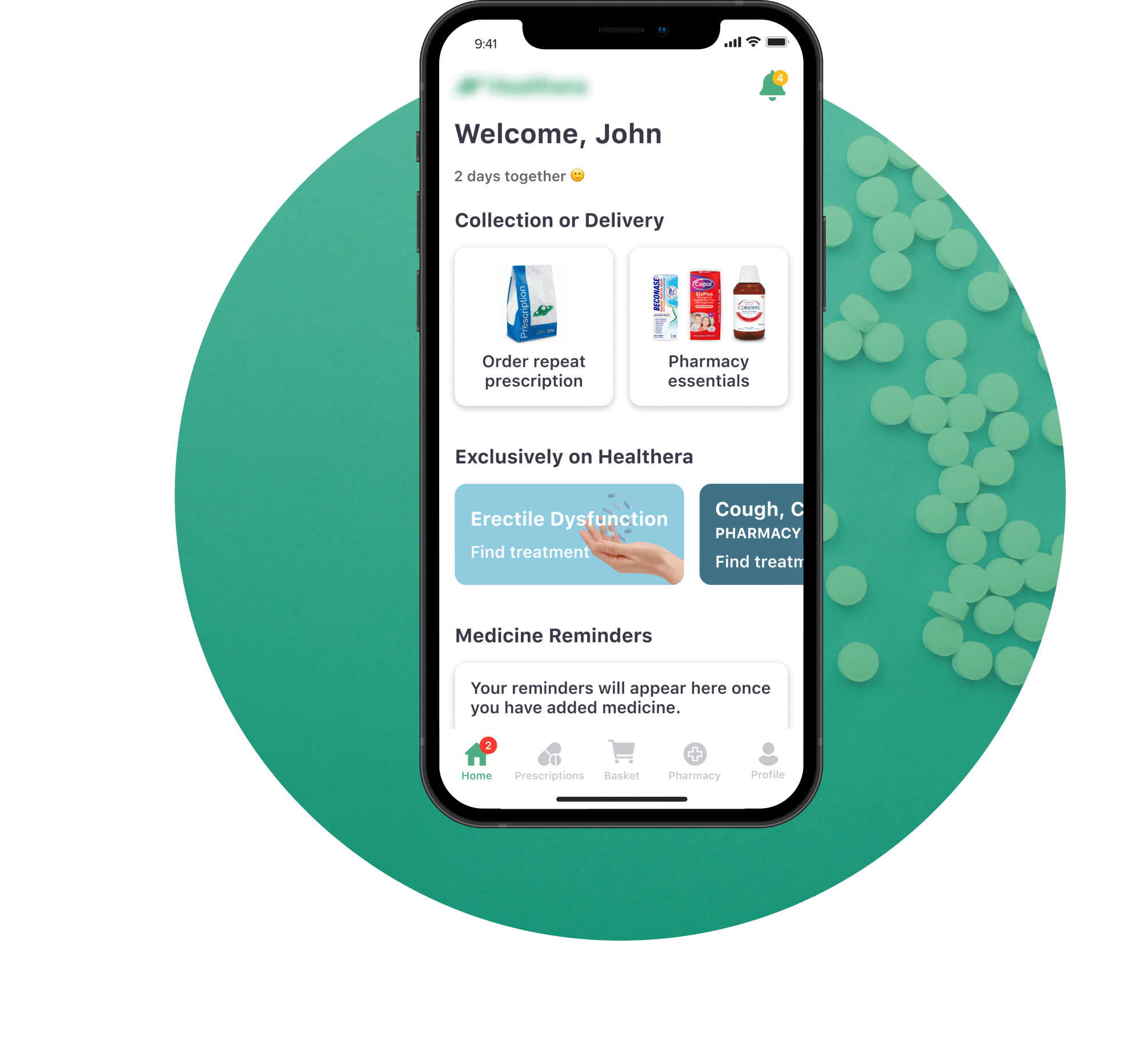
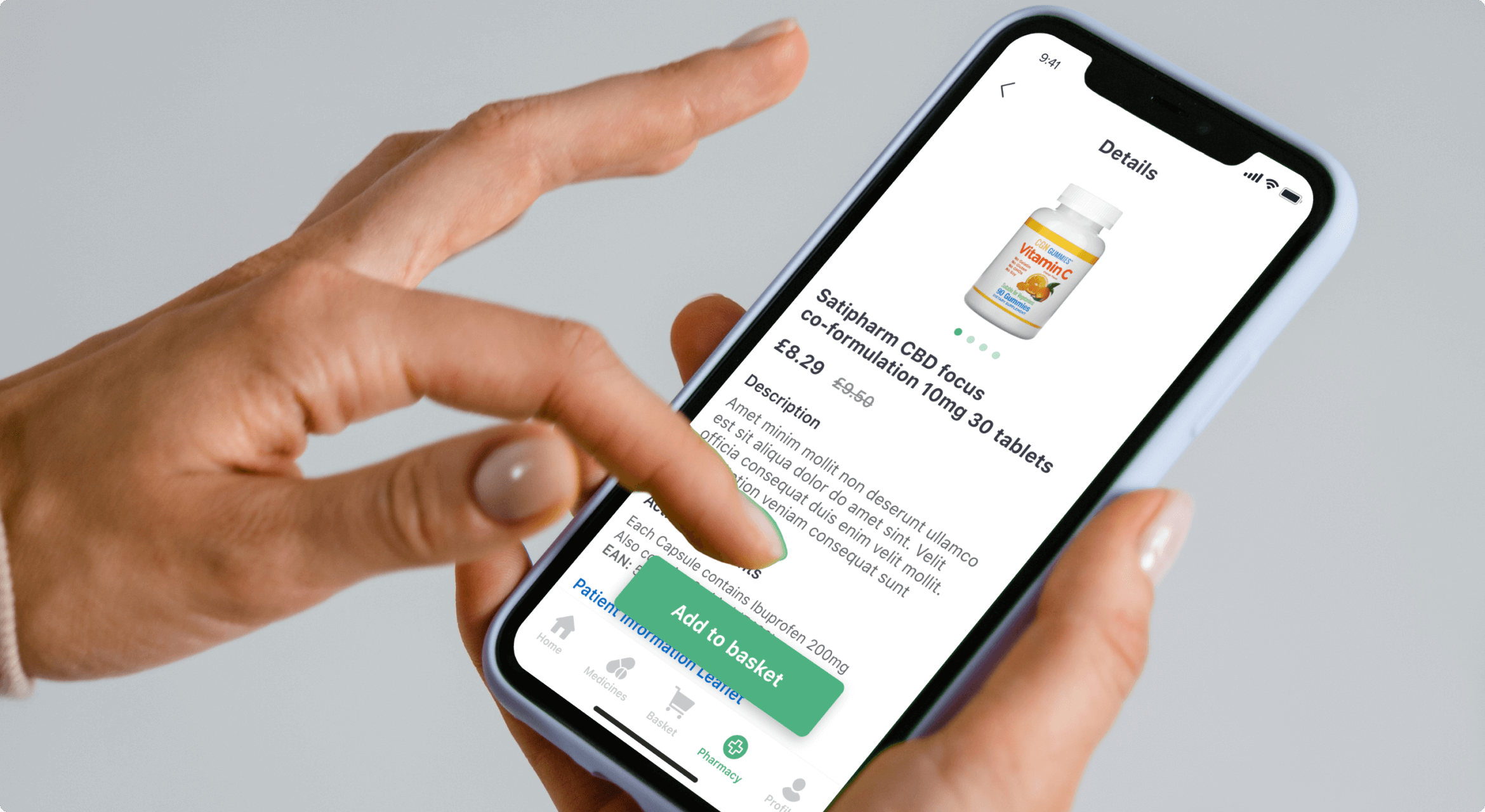
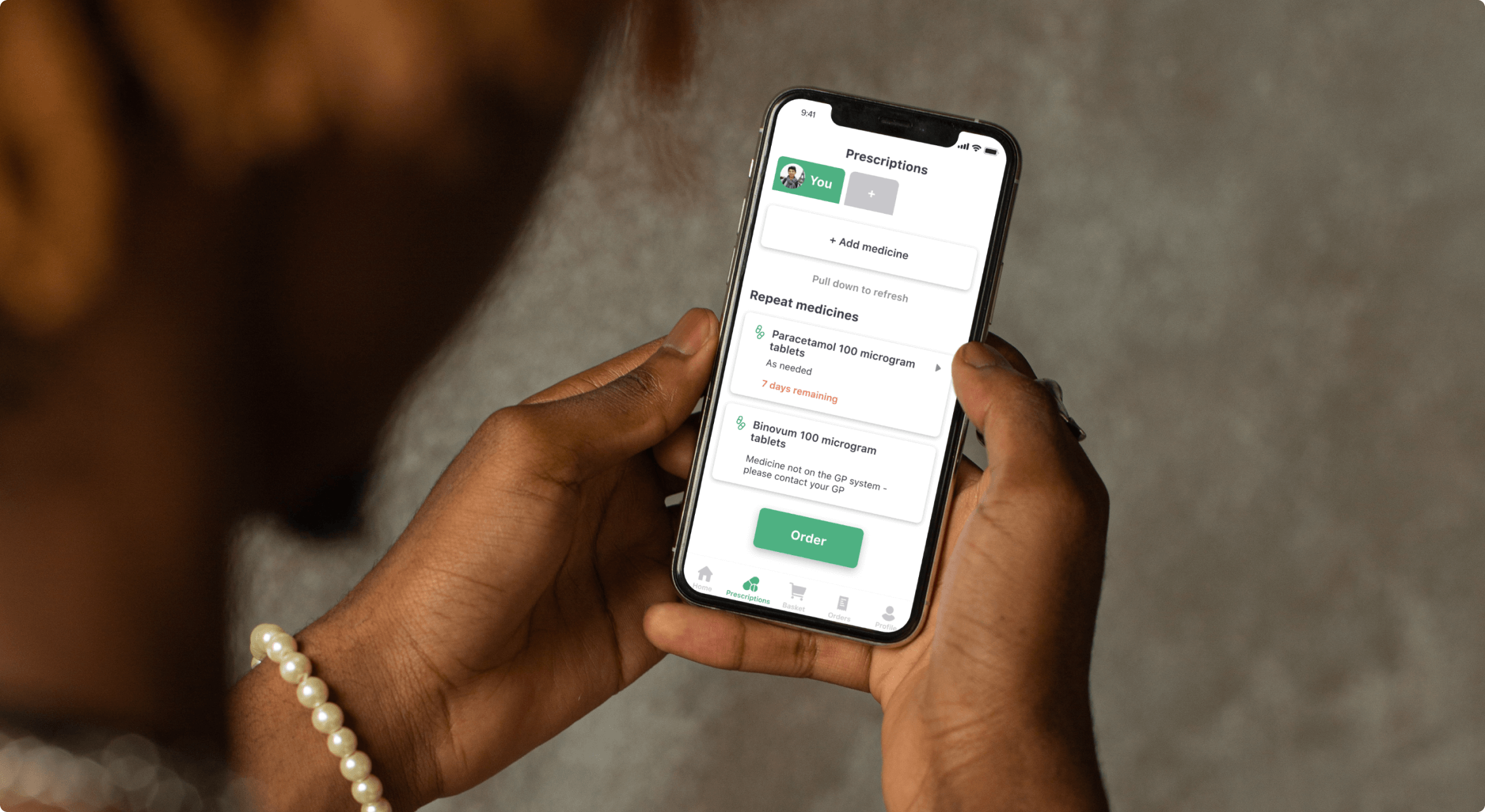
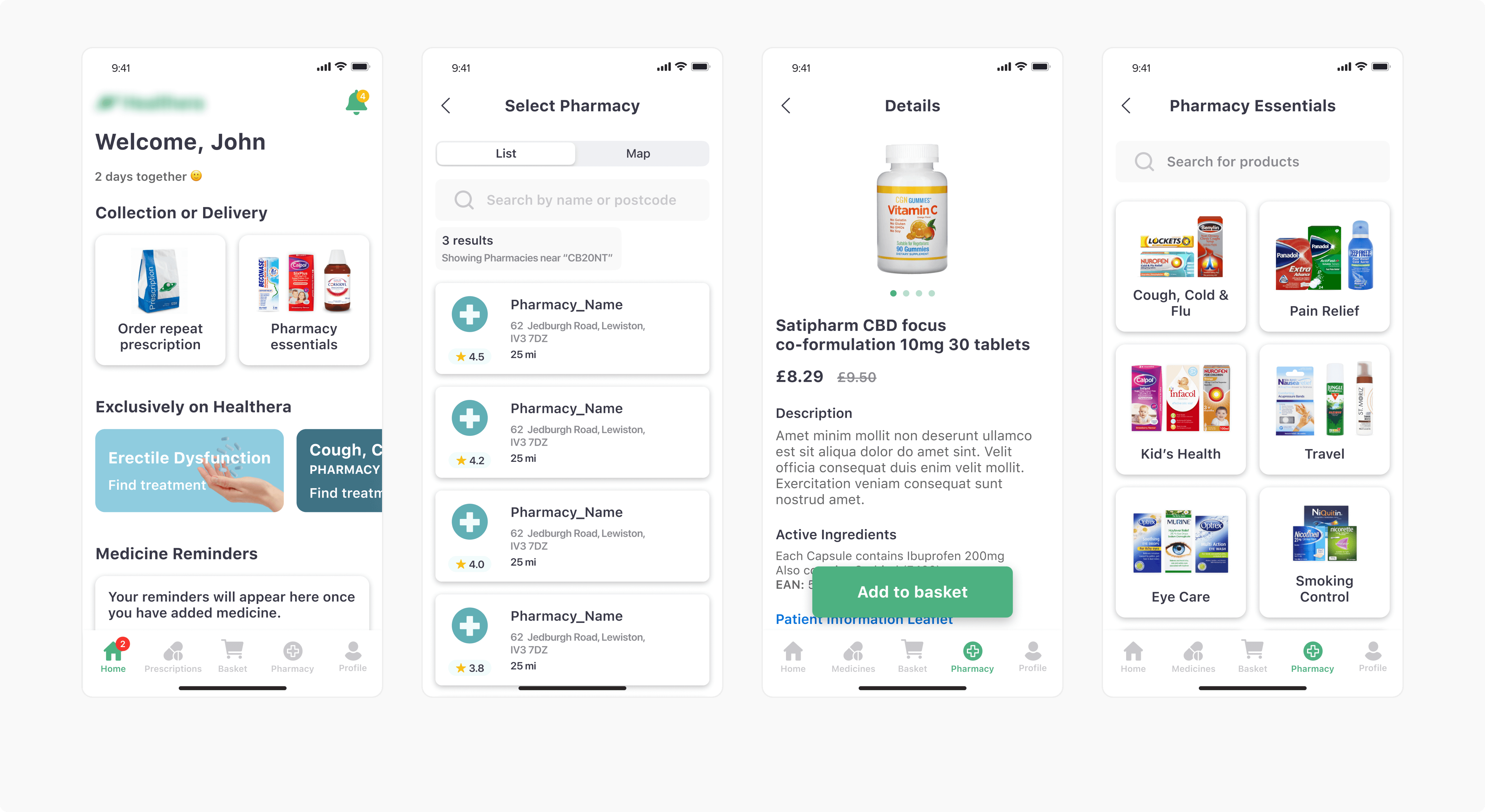
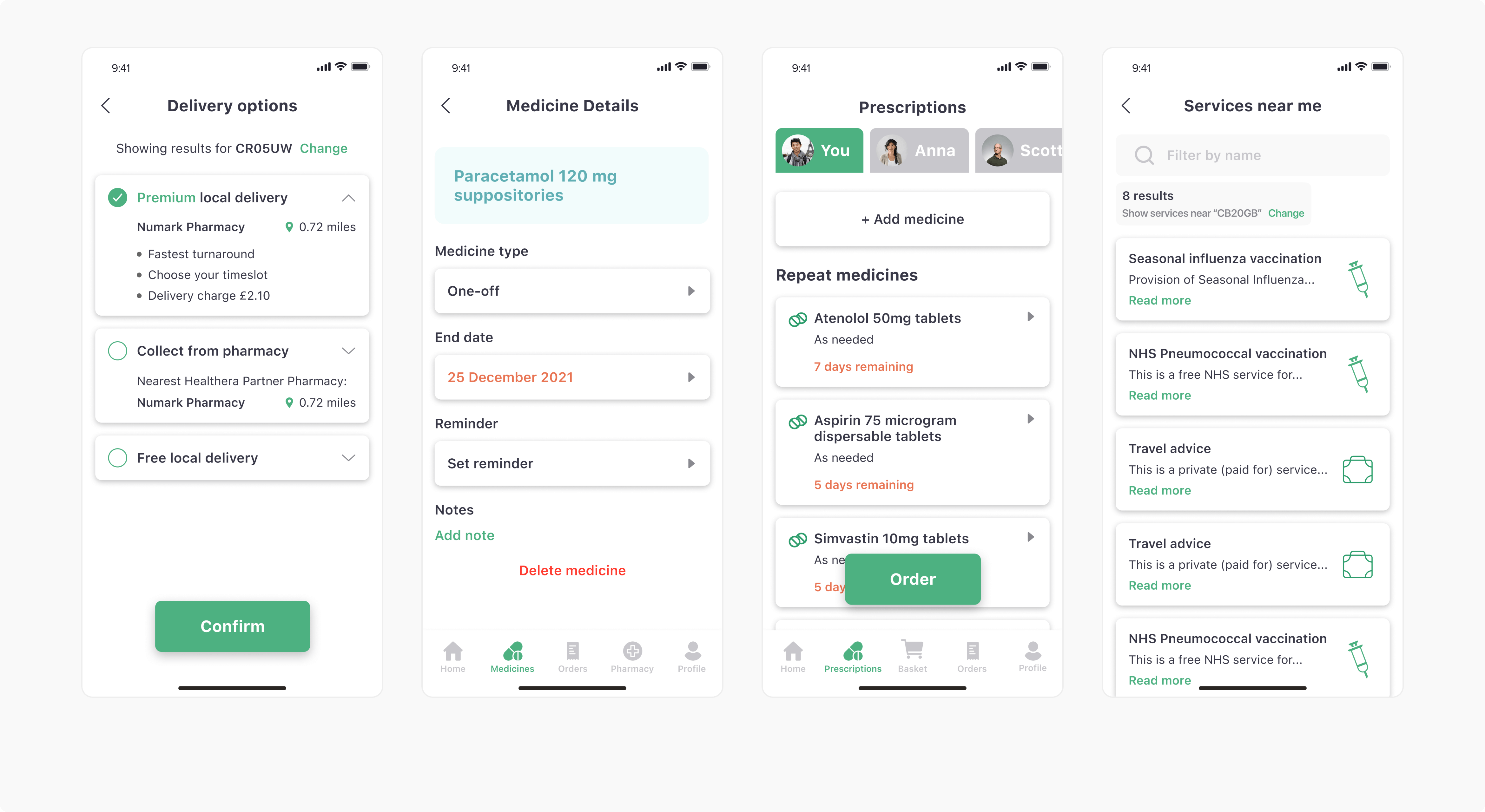
SCREENS:
Services
Product design
Design discovery & research
UX design
UI design
Technologies:
Figma
Team composition:
1 UI/UX designer
1 Project manager
THE CHALLENGE
Effortless user experience
As apps had already been provided by the client’s, we needed to improve the existing user flows and create new ones. Moreover, we had to broaden the app’s functionality in both versions.
Compelling design
NERDZLAB had to create a structured and easy-to-understand layout. The composition and the whole style were supposed to feel and look similar for both Android and iOS versions.
Order administration
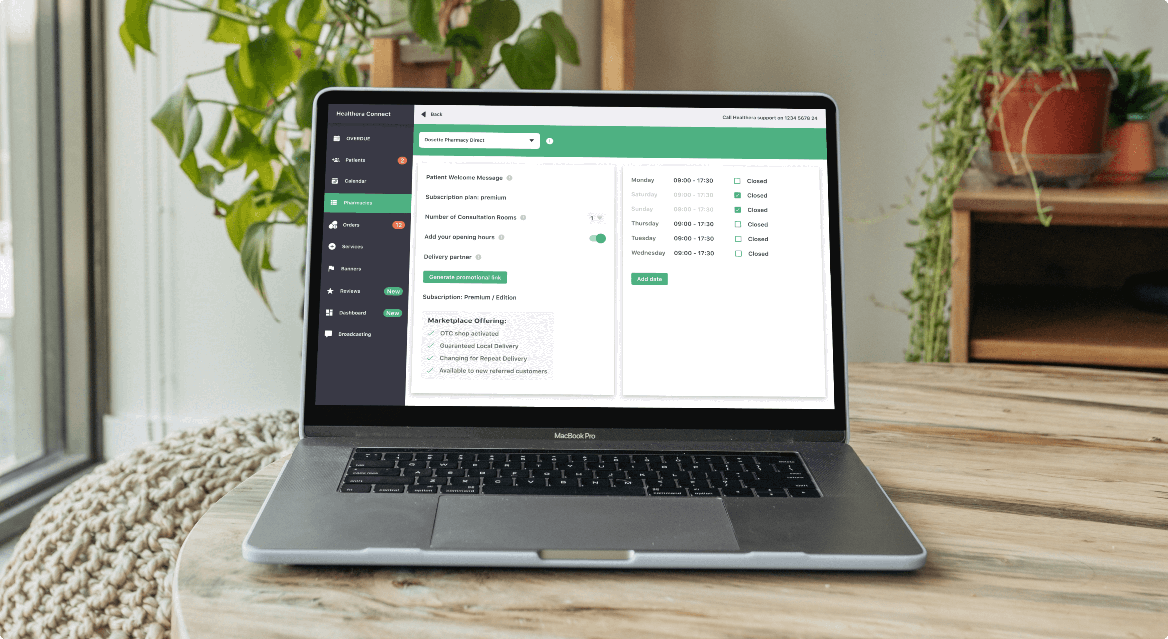
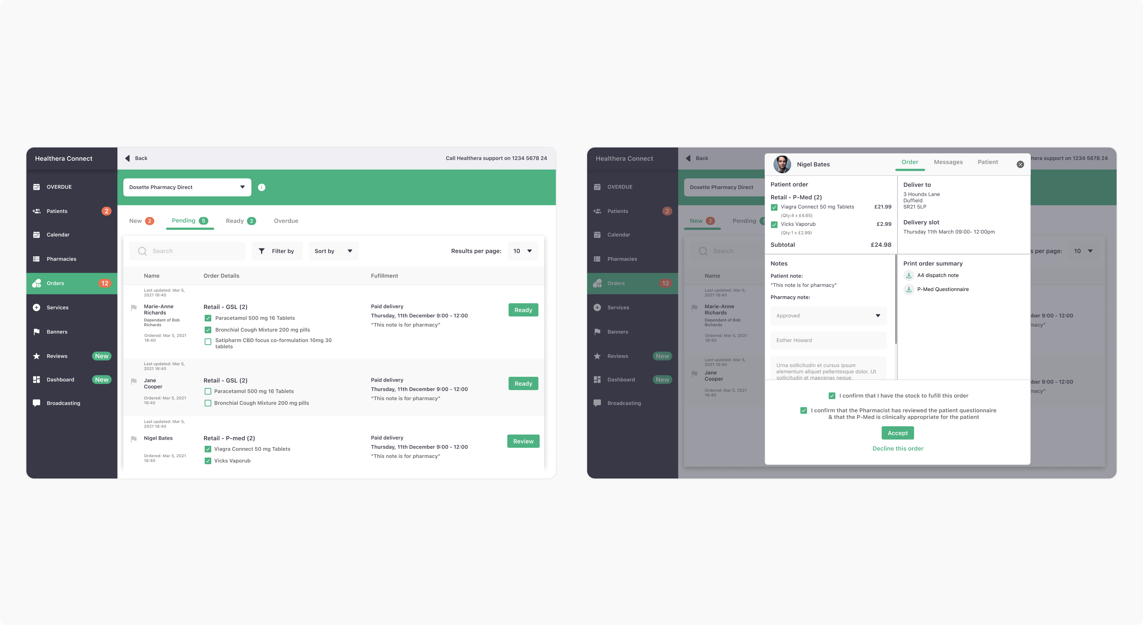
The team had to provide a web version of the admin panel to maintain the patients’ entries and manage orders. At the same time, we had to keep all this data reflected and updated on the app user’s side.
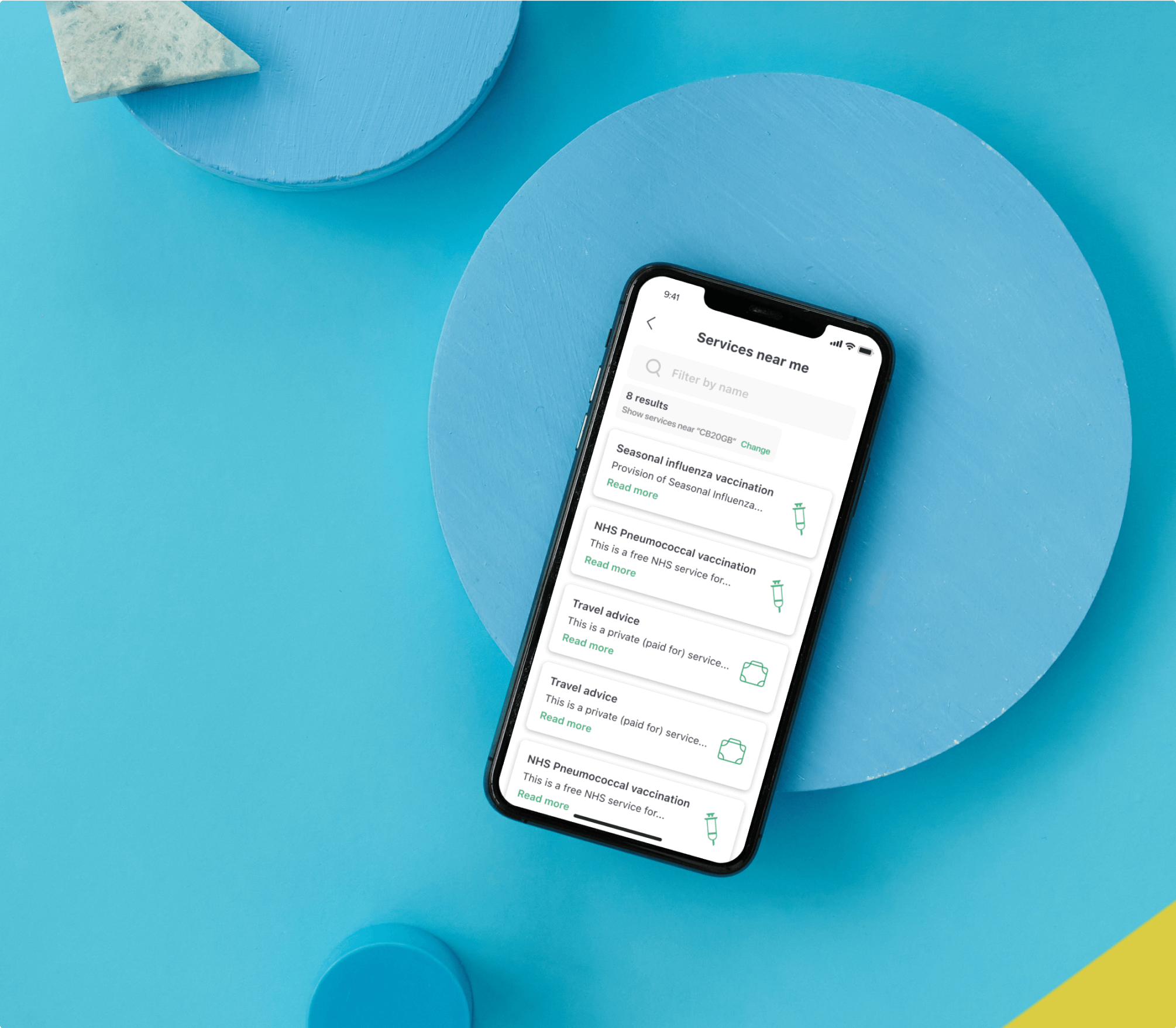
Seamless flow
The designers revised the whole customer journey. In addition to refining the already presented users’ actions, we elaborated new processes to strengthen the entire user experience.
Crisp, clean look
Taking the client’s vision and central values as the backbone of the app design, the NERDZLAB team presented a fresh, lightweight, and user-friendly interface. The Figma tool helped our designers create the main and additional visual elements.
Comprehensible admin panel
We successfully assembled all critical elements for data management. Furthermore, we ensured that the web-based admin panel renders and shows administrators all necessary information retrieved from the application, such as patients’ details, pharmacy info, and medicine orders.
DESIGN OVERVIEW
Our main task was to improve the product design and the overall patient experience. The patient app had been developed for both iOS and Android versions, so we had to deliver a design that would be consistent and feel the same on both platforms. Besides this, we had to design the web version for the admin section, which would manage patient orders. The main challenge here was to synchronize it with the patient role and create an accurate design that would cover all cases.
We started with the already existing app, and our first step was to improve the existing design and mobile flows. After completing this task, we started designing new user flows and expanding the app functionality based on metrics. This is an ongoing project, meaning we are constantly improving things. We introduce UX and UI changes to the existing product based on constant feedback from the client.
Design services we provided:
- Design discovery
- UX design
- UI design
Design solutions:
Design workflow
Client interview
We start with the right questions about the client’s vision, goals, and values to ensure we stay on the same page.
Design discovery
At this stage, we help clients see if their idea in the current form solves their customers’ problems.
Creating UX
This is where we create and enhance a painless user experience that aligns with usability guidelines and the product mission.
Creating UI
Here, the product obtains its visual shape. We make sure the client’s preferences meet the latest UI trends to design an appealing interface for the users.
Product designing processsnippets
THE RESULTS
Enhanced initial design
Advanced user experience
New flows and roles added
A functional web portal for administrators


