От халепа... Ця сторінка ще не має українського перекладу, але ми вже над цим працюємо!

Product design software lessons from the Reebok Fitness App

Sergio Varanytsia
/
UI/UX Designer
•
6 min read
Share:
Share:
•
6 min read
Sergio Varanytsia
/
UI/UX Designer
•
6 min read
Regular body activity is the pinnacle of self-discipline. Although a sedentary lifestyle doesn’t allow us to naturally move our bodies like we used to, staying active is still one of the most reliable ways of achieving longevity with joy and vitality.
Gyms used to be a solution, but the latest data shows that even giants like US-based Planet Fitness are losing momentum due to inadequate personalization, poor marketing, and an unwelcoming environment.
These and other blind spots leave space for health and fitness apps like the Reebok Fitness App to step in and redefine the user experience. And we’re not blowing things out of proportion.
Data shows 60% of fitness app users have switched from gym memberships to app-based exercises, while over 80% of users opt for home workouts over visiting gyms.

These numbers are hardly surprising, since a fitness app with a human-centered ecosystem and an intuitive digital product design guarantees user love. Notably, 8 in 10 customers will pay more for an improved experience, giving startups a direct path to stronger profitability.
This article overviews the product designing process lessons we’ve learned when transforming TruConnect into the Reebok Fitness App. Spoiler: design to be ready for everything, prepare for future scalability, and blend innovation with trusted patterns.
Article content:
![]()
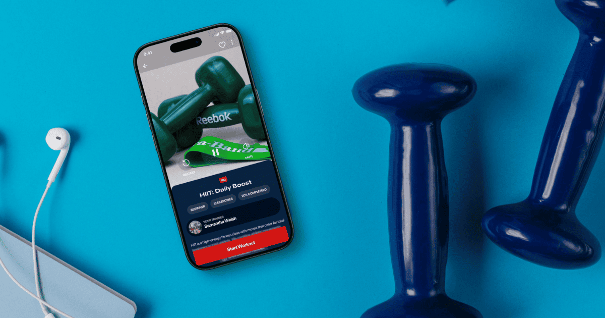
Reebok Fitness App at a Glance
“Don’t be afraid to give up the good to go for the great.” – John D. Rockefeller.
The Reebok Fitness App entered the market only recently, first introduced as TruConnect. But the name wasn’t the only thing that changed. In addition to incorporating Reebok’s signature branding elements, the application now offers a comprehensive feature set designed to meet the diverse needs of health-conscious users. Our collaboration with TruConnect began with core application development, and later expanded as NERDZ LAB took ownership of the UI/UX design process.
We developed a complete design system with adaptable elements that accommodate dark and light themes. It became a strong base that allowed design and development to scale quickly.
The road ahead is full of learning curves, but what helps our team the most is a deep dive into Reebok’s ecosystem and the flexibility to adapt as requirements evolve.
Learn more about NERDZ LAB healthcare software development services.

What we learned along the way
The NERDZ LAB team, together with our trusted partner TV.FIT has been working on the fitness application since August 2024. The challenging yet captivating project helped us realize several vital lessons on software product design that we would like to share with our audience:
Blending signature style with familiar flows
Design teams often struggle to introduce innovative features while maintaining the app’s signature look and feel. Yet failing to do so can lead to missed opportunities for differentiation and long-term user loyalty, and even discontinued collaborations. Official fonts, color schemes, and text styles are just a few of the style guide essentials.
How did we find a way through? Fortunately, our earlier work (e.g., newly created design system, components, color, and text styles) made the technical adaptation much smoother. Our team studied Reebok’s ecosystem as much as we could with the time we had, analyzed existing products, and identified areas where we could add uniqueness without breaking brand standards.
We then incorporated Reebok’s brand identity components across the app, such as color schemes, typography, and layouts. On top of that, we set up two bespoke Reebok fonts with distinct configurations, replacing the original font, and added both the light and dark themes to align with Reebok’s standards.
Keeping the unique brand identity in mind, we still ensured that the customer experience is fresh and seamless, staying true to ourselves while addressing the customer’s needs.
So, what’s the key takeaway here? Boundaries can spark creativity. Don’t view strict brand guidelines as walls; they’re your guiding lights for iconic products users love.

Thinking ahead to wearable integrations
Don’t stop once you’ve achieved some level of success and recognition. There’s a high chance future scalability will demand integrating smart wearable devices, especially considering that the health and fitness industry increasingly relies on wearable data to deliver personalized, engaging experiences.
Designing for wearables means the size of the device severely limits the team, so we had to create not just for screens, but also account for the limitations and opportunities of the wearable device.
However, the core pain point was that the data we could access from the wearable depended entirely on the hardware manufacturer. We worked with limited information and had to adapt as new technical details emerged.
Continuous iterations and constant revisions turned into our strongest allies in securing the natural look and feel of the wearable. On top of that, our fitness app development team showcased the highest level of flexibility and professionalism, significantly contributing to the final outcome. Stay tuned, we’ll be breaking that down in an upcoming article.
As a result, the NERDZ LAB team learned that user-centered design is always future-proof. Even if wearables are not currently on your product roadmap, design your UI, interaction patterns, and architecture to be scalable for hardware integrations.
More on our product design services
Scaling through iterative design
To ensure a smooth integration of the wearable device, we adopted an iterative design approach that allowed us to gradually refine the data visualization interface. This approach was crucial since, at first, our design relied heavily on assumptions about the device’s capabilities. Over time, as we received more data from the hardware team, we iterated and refined the interface, ensuring everything feels intuitive and performs seamlessly.
Currently, the iterative design approach has helped us create a solid foundation for scalability and wearables integrations. And we’re just getting started. The takeaway? Dynamic, user-centered projects that demand continuous refinement and constant feedback loops thrive on an iterative design approach.
Designing multiple features at once
Although most of our expertise was focused on wearable integration, we also designed additional features to ensure the app evolved as a complete, well-rounded product. As a result, we’ve learned that concurrent execution speeds up processes and supports innovation, showcasing your expertise as a product design company.

From startup to scale: designing to minimize rework
If you want your product to thrive, treating UI/UX design as a fundamental, non-negotiable foundation is the best thing you can do to save costs later throughout the project and ensure your users don’t leave for the competition. Nearly 94% of first impressions depend on design, frequently occurring in less than 50 milliseconds. At the same time, conversion rates can double with a well-designed interface, increasing by 400% with a strong UX approach.
How to design to minimize rework
Remember, a future-proof design isn’t about making things “look nice”. It’s about taking a deep, well-versed approach to human psychology and how they behave in different scenarios. Slow WiFi? Design with lightweight assets, caching, and graceful fallbacks. Glitchy wearable sync? Build flexible error handling and real-time status feedback.
It all boils down to helping end users navigate from one section to another without wasting time. They want to finish their tasks fast, enjoy the process, and have everything they need in one place.
You will tick all these boxes by creating UX wireframes, a skeletal framework, a carefully considered design approach with a coherent hierarchy, visual guides, and in-depth analysis of your user personas’ needs, actions, and expectations.
Your experience design strategy will be a success if you follow these rules:
-
Partner with designers early. Treating UI/UX as a last coat of paint can only lead to clumsy workflows and disappointed customers.
-
Always prototype in the medium you intend to deliver. It helps validate usability, interaction patterns, and technical constraints early in the design process.
-
Work with the designers who focus on the psychology of your target user. Having an appealing design is good, but prioritizing the logic behind every interaction is what will differentiate you from the competition.
-
Design for the worst-case scenarios, like slow Wi-Fi, confused users, and midnight panic clicks. Helping users navigate easily during unpredictable situations demonstrates your commitment to reliability and empathy.
At NERDZ LAB, we’ve committed to following these guidelines, which helped us create a beautiful product design and build a fitness app that meets and exceeds user expectations under the Reebok brand.

Wrapping up
The Reebok Fitness App is still being refined today, and we’re working on additional features that will give it even more functionality to help fitness enthusiasts worldwide. Our commitment to the best UI/UX design principles helped us showcase our potential and prepare for exciting future collaborations.
If you want to learn more about our digital product design services, contact NERDZ LAB. We can schedule a consultation to discuss your project’s vision and implement even the most intricate ideas!
Get more insights:
See all