От халепа... Ця сторінка ще не має українського перекладу, але ми вже над цим працюємо!

Why you and your tech partner should prioritize usability testing

Olena Slyvka
/
UI/UX Designer
9 min read
What’s your product’s strongest advantage in winning customers and capturing market share? A standout user experience, hands down. So, how do you know you’re offering one? The answer is simple: usability testing.
Skipping this key step in your software development lifecycle means missing out on the chance to boost conversions, grow user loyalty, and cut support costs. And that’s not just talk — we’ve had startup clients who’ve enjoyed these exact benefits and seen others who’ve regretted cutting the usability testing corner.
Let’s dive into the real reasons why you need usability testing and what it involves.
Article content:
![]()
What is usability testing anyway?
Simply put, usability testing is a way to check how well your website, app, or digital product works by having real users try to complete tasks with it.
This is worth pointing out because usability testing is often confused with user testing, which is a bit different.
An essential part of the UI/UX design process, usability testing zooms in on how simple and intuitive it is for users to interact with your product. The main question it helps you answer is:
Can users complete their tasks or reach their goals with our product easily?
In contrast, user testing is a broader testing concept. User testing measures a range of feedback and performance metrics, which may or may not include ease of use. The biggest question it helps to answer is:
What do users think about using our product or service?
If you’re in a startup on a tight budget, it’s tempting to just get other team members or peers to test usability. But that means you miss out on how people will understand and use your product in the wild. A much better approach is to prepare a test design and workflow to get real users to spot issues for you, as they are less biased and more representative of your target audience.
See also: Accessibility in mobile development: Creating an app for everyone
The key elements of usability testing
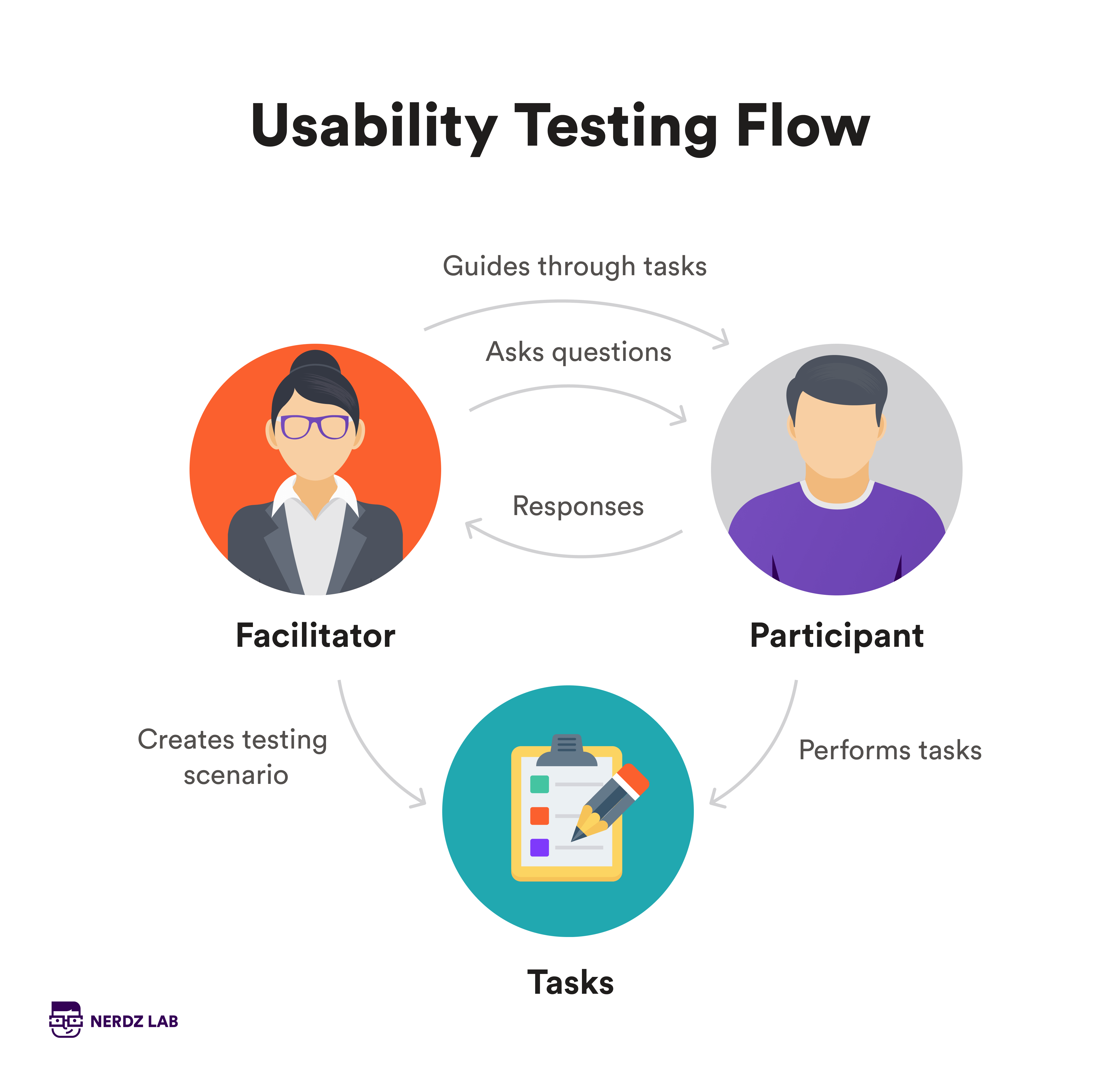
Usability testing requires three core elements:
- Tasks: Real-world tasks that users need to complete during the test.
- Participants: Real users who represent your target audience and provide valuable insights.
- Facilitator: The person who leads the test, assigns tasks, and answers any questions.
When you combine a skilled facilitator, realistic tasks, and the right participants, you uncover your key usability issues and get to make smarter, more user-focused design improvements.
To better focus your efforts, you can also use different types of usability testing.
Usability testing types
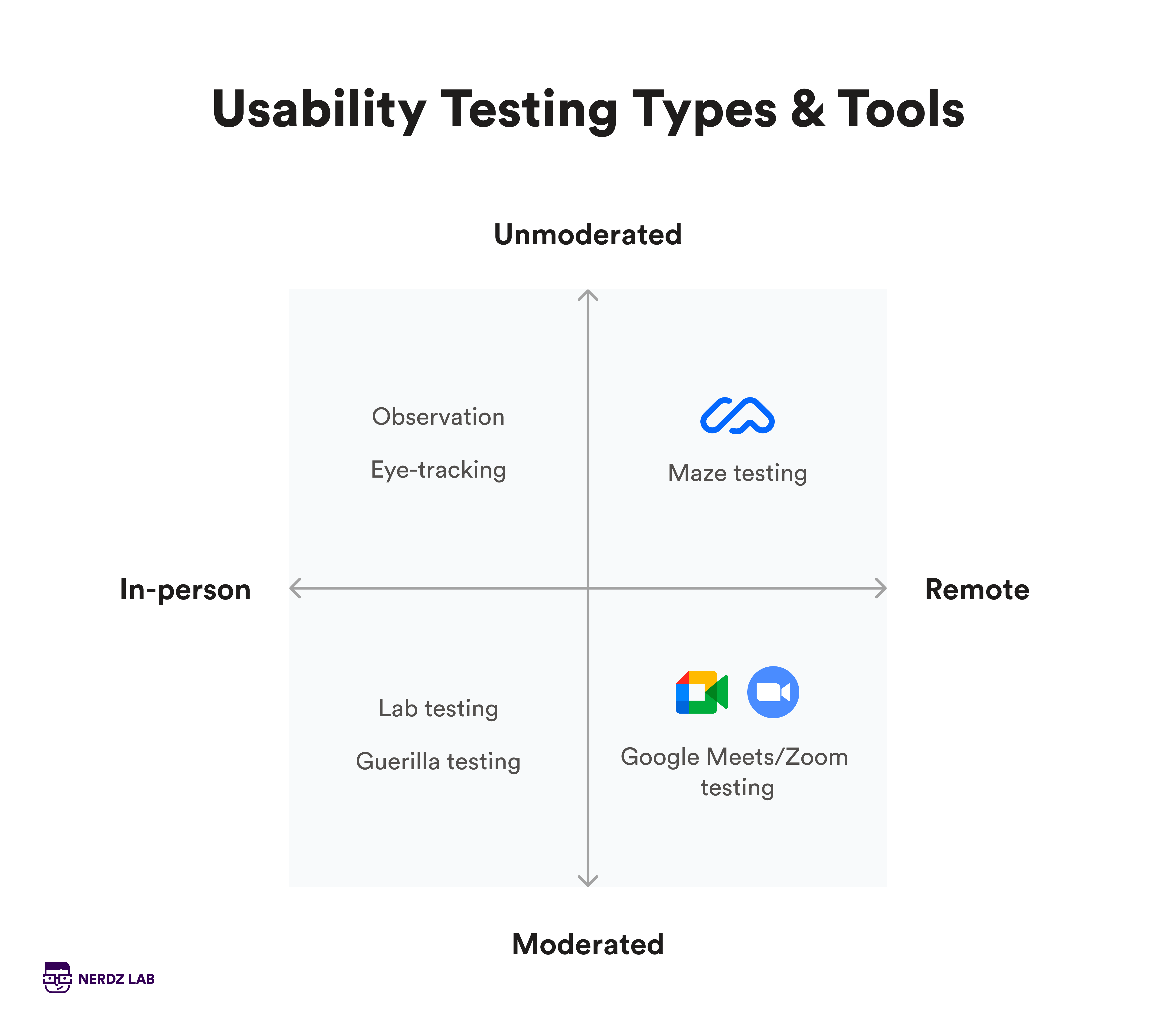
There are two types of usability testing: moderated and unmoderated.
In moderated usability testing, a moderator guides participants through the process, either in person (where they can directly observe users) or remotely via video calls with screen sharing. This method is awesome for uncovering the “why” behind user behavior, giving you valuable, qualitative insights that can shape design decisions early on.
Unmoderated usability testing, on the other hand, lets participants complete tasks on their own without a moderator. It’s perfect for testing specific features and usually involves automated tools. This method shines when you need quantitative data — it’s ideal for spotting patterns and tracking how often issues or behaviors pop up.
If you don’t know which you need, think of it like this:
- Moderated testing is great for deep insights early in the design process, though it’s more expensive and time-consuming.
- Unmoderated testing is faster and more cost-effective, perfect for collecting data at scale but lacking the personal touch of a moderator’s guidance.
Design audit vs. usability testing
While not strictly a part of usability testing, a design audit can be a useful complement. Here’s how they differ and relate:
- Usability testing: Focuses on real-time data about how users interact with your product and the issues they encounter. It’s about observing actual user behavior and gathering feedback to refine the user experience.
- Design audit: Provides an expert evaluation of the design based on established principles and best practices. It’s often carried out before usability testing to identify design flaws that could affect user experience.
A design audit can be a useful first step as it helps catch clear design problems before you dive into testing. This ensures that when you test with real users, you’re addressing issues that might not be immediately apparent but could still impact UX.
See also: From idea to launch: The role of the discovery phase in software development projects
When, why, and how to do usability testing
A common mistake is thinking usability testing should only happen near the end of development, just to catch bugs. In reality, usability testing should be an integrative part of your SDLC.
Continuous usability testing helps keep your product relevant and user-focused throughout its lifecycle. You can tailor your testing to fit any stage of development, but here’s when to make it a priority for a great final UX:
Before designing: Early research helps you build a strong, user-centered design foundation, and you don’t even need a product to do it. Consider usability testing with a competitor app: if users frequently struggle with a particular feature, you can avoid those pitfalls in your own design.
With wireframes or prototypes: Test your design at each stage as you move from wireframes to prototypes. This iterative testing helps you tweak and improve based on real user feedback. Imagine you’re testing a prototype for an e-commerce site, and users find the checkout process confusing. Adjustments made here can lead to a smoother experience in the final product, and they’re much cheaper to fix at this stage.
Before launch: Conduct a final round of testing to check that your product is ready for the market. Summative testing helps determine if your product is up to par or if more tweaks are needed. For instance, if users struggle with the final version of a mobile app’s navigation, you’ll want to address these issues before the official launch.
After launch: Don’t stop testing once your product is live. Ongoing usability testing ensures your product remains user-friendly and up-to-date. For example, if user feedback shows new features aren’t as intuitive as expected, you can plan updates and improvements. This cycle of testing, updating, and re-testing helps keep your product fresh and relevant.
Benefits of usability testing
The benefits of usability testing combine the advantages of good UX with the business benefits of more efficient development, resulting in:
- Increases conversions: Used pre-design, usability testing ensures your product is built to be intuitive and user-friendly from the ground up. This leads to a smoother user experience, which can significantly boost conversion rates. For example, streamlining the checkout process on an e-commerce site can reduce cart abandonment and increase sales.
- Enhances user loyalty: A product that’s easy to use and meets user needs fosters a positive UX, which enhances user satisfaction and loyalty. Usability testing helps fine-tune your product to align with expectations, keeping users coming back more frequently and for longer.
- Reduces support costs: A well-designed product minimizes user errors and confusion, which in turn reduces the need for extensive customer support. Similar to user testing, which identifies common user challenges and confusions before launch, usability testing helps you lower the volume of support requests and associated costs.
- Improves product efficiency: Usability testing tells you exactly where users are struggling so you can better direct your development roadmap. You get a more efficient product that performs well and meets user needs, ultimately improving your chances of success in the market.
- Ensures user-centric design: Regular usability testing throughout the development process ensures that your product remains aligned with user needs and expectations. This ongoing feedback loop allows you to make informed design decisions that enhance the overall user experience.
- Boosts business success: This is your ultimate goal. By creating a product that’s intuitive, effective, and easy to use, usability testing directly contributes to achieving business goals such as increased market share and enhanced competitive advantage. A user-friendly product is much more likely to attract and retain customers, driving business growth.
For more insights on how our usability testing services and proven testing approaches can enhance your product and streamline development, explore A story of software testing services at NERDZ LAB.
Popular usability testing tools
The right tool stack for usability testing depends on the type of testing you’re doing. Here are the most common tools to get you started.
| Tools for unmoderated usability testing | Tools for moderated usability testing |
| Maze – Offers heatmaps, click tracking, and quantitative task data. | Zoom – Allows video conferencing with screen sharing, perfect for live moderated tests. |
| Hotjar – Includes heatmaps and session recordings to track user behavior. | Google Meet – An alternative to Zoom that integrates seamlessly with other Google tools. |
| UserTesting – Provides user video feedback with task completion tracking, allowing you to observe how users interact with your product. They also offer access to their own panel of testers and provide test templates to streamline the testing process. | UserTesting – Supports live moderated sessions and gives real-time feedback through videos and screen sharing. |
| Optimal Workshop – Focuses on tree testing and first-click testing for navigation insights. | WebEx – Provides video conferencing with screen sharing, perfect for live, remote moderated tests. |
| Lookback – Allows users to perform tasks independently while being recorded for later review. | Lookback – Enables live remote interviews with screen sharing and recording. |
| TryMyUI – Records participant experiences and screen interactions: a good choice for user interface design testing. | UserZoom – Supports real-time participant management and insights. |
| Loop11 – Helps gather quantitative data such as task success rates and times. | GoToMeeting – Offers screen sharing and recording features for live usability tests. |
| UsabilityHub – Conducts preference tests, navigation assessments, and design surveys. | Microsoft Teams – Ideal for moderated testing with built-in screen sharing. |
Usability testing at NERDZ LAB
Usability testing, along with user experience testing and design testing, is a core part of our user-centric product design approach at NERDZ LAB. We use different tools to ensure our products meet user needs and expectations.
One of our top choices is Maze. It allows us to test with the right audience by selecting respondents based on specific demographic criteria. Maze provides both quantitative and qualitative insights, giving us a full picture of the user experience. It’s also cost-effective and integrates smoothly with Figma, so we can gather feedback directly from the design platform.
We’ve relied on Maze in multiple projects, such as in design testing for Rosecut, where it provided crucial user feedback. In other projects, like the all-in-one personal manager app, we carried out detailed UX design audits that helped us spot potential issues early, setting the stage for more effective user testing later on.
We also developed Userfeel — a usability testing tool that records videos of real users speaking their thoughts as they use a website or app. Userfeel works on both iOS and Android and records and uploads testing videos in the background, with features like file compression and automatic recovery for interrupted uploads. We use it for unmoderated usability testing, providing real-time feedback from actual users, which helps us refine designs to meet user needs more effectively.
Whether we’re testing with Maze, auditing UX designs, or leveraging tools like Userfeel, the focus of our usability testing services remains the same: delivering intuitive, effective designs that are tailored to your target users.
What you get from usability testing
The results of usability testing give you a clear snapshot of how real users interact with your product. In practice, that means you get data, which can be either qualitative or quantitative.
Qualitative outcomes of usability testing
Qualitative usability testing is all about the details — how users interact with your design and where they hit snags. It’s a more hands-on approach that helps you spot and understand specific usability issues.
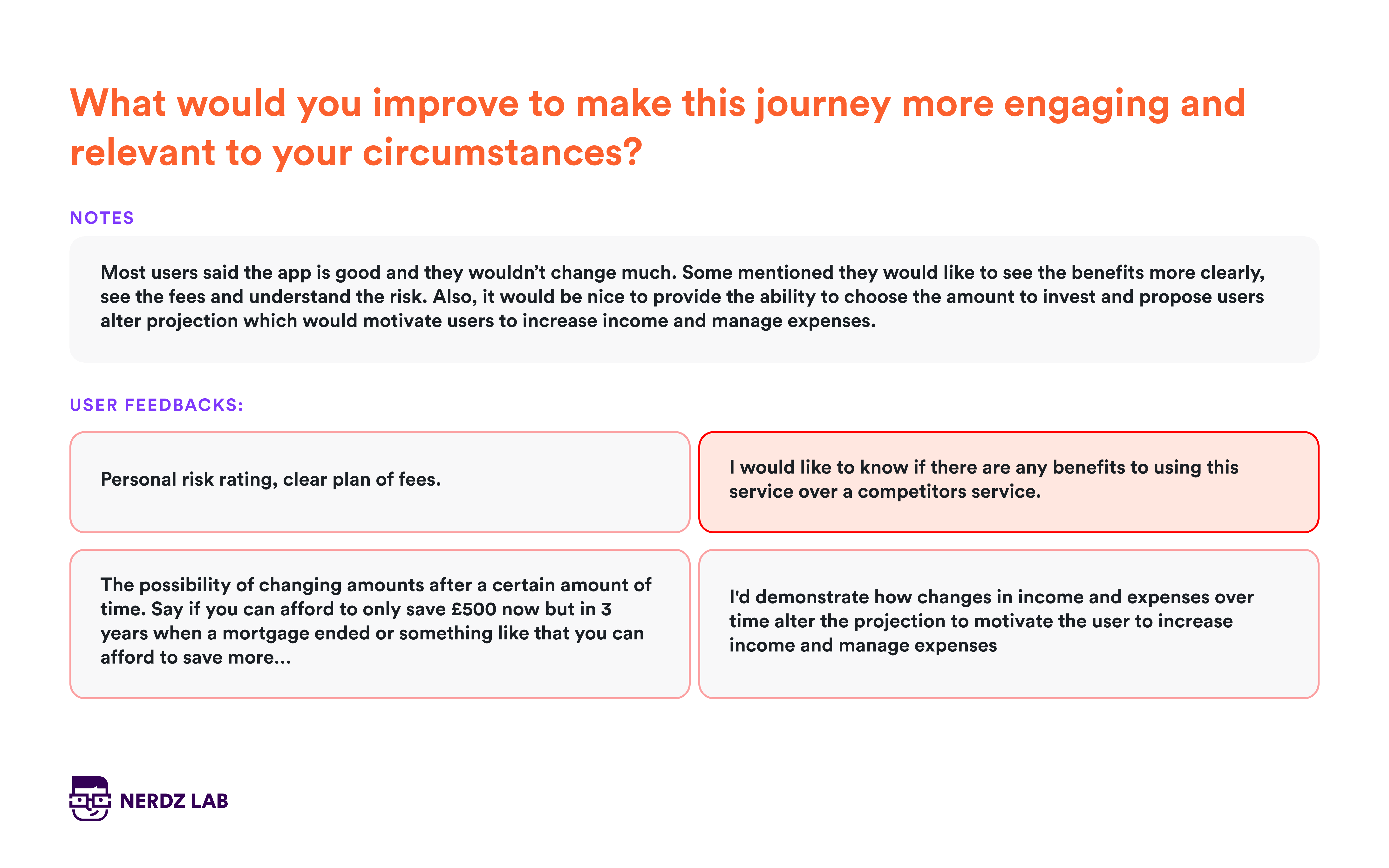
Examples of qualitative testing results:
- Form submission errors: Users might repeatedly struggle to submit a form because of unclear error messages or confusing field requirements. Observing this helps identify what needs fixing.
- Confusing navigation: If users are frequently getting lost or unsure about where to click next, this highlights navigation problems that need addressing.
- Poorly labeled fields: If users consistently misinterpret what you’re asking them to enter, it’s a sign that labels or instructions need to be clearer.
You can gather qualitative data by watching users interact with your product and asking them follow-up questions. This type of testing is invaluable during the design phase to make sure the final product is intuitive and user-friendly.
Quantitative outcomes of usability testing
Quantitative usability testing gives you hard numbers on how well users are able to complete tasks. This approach is about gathering data on performance metrics to evaluate usability objectively.
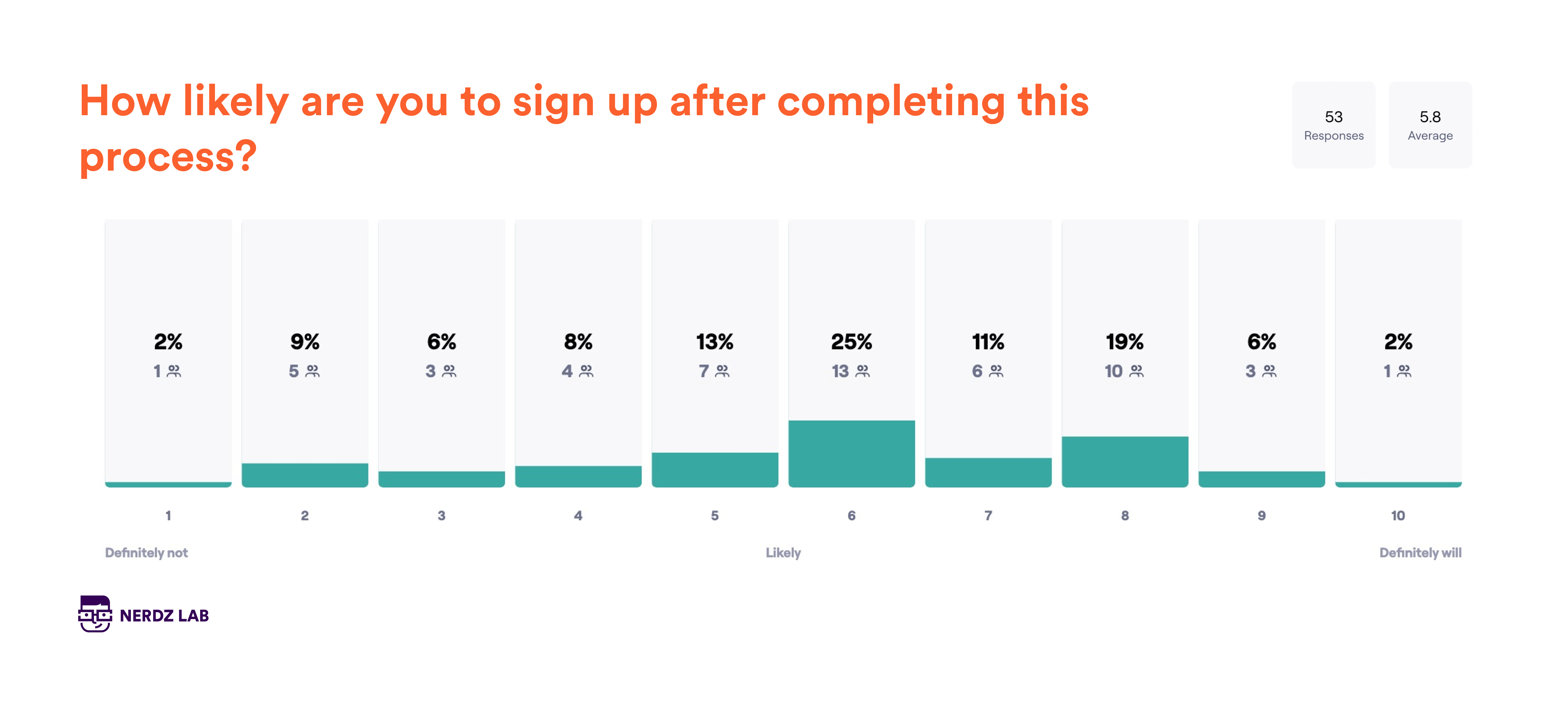
Examples of quantitative testing results:
- Task completion rates: 80-90% of users successfully completing a task is a good benchmark. If your numbers are significantly lower, you’ll need to address design issues.
- Error counts: Tracking how many errors users make during tasks can highlight problem areas. For example, if users make frequent errors while filling out a form, it might need redesigning.
- Task completion times: Here, targets will vary according to task complexity. For instance, if users consistently take longer than expected to complete a checkout process, the design might need to be streamlined.
Quantitative data is useful structured feedback that helps you track improvements. However, it doesn’t explain why users encounter issues, which is why you need both qualitative and quantitative feedback to improve your product.
“Shift left” is becoming a standard requirement for secure systems design. In short, it means addressing security concerns as early as possible in the development.

To sum up
By focusing on real user interactions, usability testing helps you boost conversions, enhance customer loyalty, and reduce support costs. The goal is always a smoother, more intuitive, and effective product that engages and helps your users.
In the end, it’s about us working together: you bring the idea or need for a standout new product, and we help you develop it so it performs at its best and contributes to long-term business success. If you’re looking for a development partner who’s been in your shoes but is further down the road, get in touch. We’d love to be part of your story.

